WealthCycle example (PDF)
File information
Title: WealthCycle
Author: Hayden Brown
This PDF 1.5 document has been generated by LaTeX with hyperref package / pdfTeX-1.40.19, and has been sent on pdf-archive.com on 01/06/2020 at 04:20, from IP address 202.90.x.x.
The current document download page has been viewed 348 times.
File size: 223.93 KB (10 pages).
Privacy: public file


File preview
WealthCycle
Hayden Brown
2020-05-23
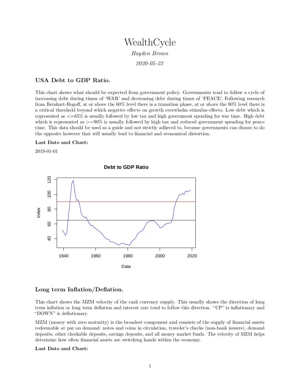
USA Debt to GDP Ratio.
This chart shows what should be expected from government policy. Governments tend to follow a cycle of
increasing debt during times of ‘WAR’ and decreasing debt during times of ‘PEACE’. Following research
from Reinhart-Rogoff, at or above the 60% level there is a transition phase, at or above the 90% level there is
a critical threshold beyond which negative effects on growth overwhelm stimulus effects. Low debt which is
represented as <=65% is usually followed by low tax and high government spending for war time. High debt
which is represented as >=90% is usually followed by high tax and reduced government spending for peace
time. This data should be used as a guide and not strictly adhered to, because governments can choose to do
the opposite however that will usually lead to financial and economical distortion.
Last Date and Chart:
2019-01-01
80
40
60
Index
100
120
Debt to GDP Ratio
1940
1960
1980
2000
2020
Date
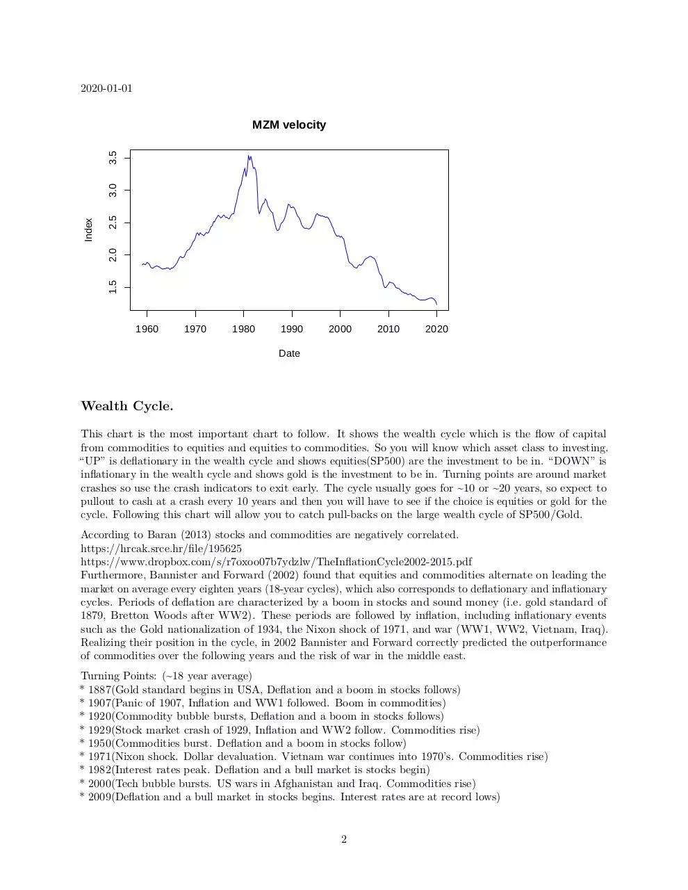
Long term Inflation/Deflation.
This chart shows the MZM velocity of the cash currency supply. This usually shows the direction of long
term inflation or long term deflation and interest rate tend to follow this direction. “UP” is inflationary and
“DOWN” is deflationary.
MZM (money with zero maturity) is the broadest component and consists of the supply of financial assets
redeemable at par on demand: notes and coins in circulation, traveler’s checks (non-bank issuers), demand
deposits, other checkable deposits, savings deposits, and all money market funds. The velocity of MZM helps
determine how often financial assets are switching hands within the economy.
Last Date and Chart:
1
2020-01-01
2.5
1.5
2.0
Index
3.0
3.5
MZM velocity
1960
1970
1980
1990
2000
2010
2020
Date
Wealth Cycle.
This chart is the most important chart to follow. It shows the wealth cycle which is the flow of capital
from commodities to equities and equities to commodities. So you will know which asset class to investing.
“UP” is deflationary in the wealth cycle and shows equities(SP500) are the investment to be in. “DOWN” is
inflationary in the wealth cycle and shows gold is the investment to be in. Turning points are around market
crashes so use the crash indicators to exit early. The cycle usually goes for ~10 or ~20 years, so expect to
pullout to cash at a crash every 10 years and then you will have to see if the choice is equities or gold for the
cycle. Following this chart will allow you to catch pull-backs on the large wealth cycle of SP500/Gold.
According to Baran (2013) stocks and commodities are negatively correlated.
https://hrcak.srce.hr/file/195625
https://www.dropbox.com/s/r7oxoo07b7ydzlw/TheInflationCycle2002-2015.pdf
Furthermore, Bannister and Forward (2002) found that equities and commodities alternate on leading the
market on average every eighten years (18-year cycles), which also corresponds to deflationary and inflationary
cycles. Periods of deflation are characterized by a boom in stocks and sound money (i.e. gold standard of
1879, Bretton Woods after WW2). These periods are followed by inflation, including inflationary events
such as the Gold nationalization of 1934, the Nixon shock of 1971, and war (WW1, WW2, Vietnam, Iraq).
Realizing their position in the cycle, in 2002 Bannister and Forward correctly predicted the outperformance
of commodities over the following years and the risk of war in the middle east.
Turning Points: (~18 year average)
* 1887(Gold standard begins in USA, Deflation and a boom in stocks follows)
* 1907(Panic of 1907, Inflation and WW1 followed. Boom in commodities)
* 1920(Commodity bubble bursts, Deflation and a boom in stocks follows)
* 1929(Stock market crash of 1929, Inflation and WW2 follow. Commodities rise)
* 1950(Commodities burst. Deflation and a boom in stocks follow)
* 1971(Nixon shock. Dollar devaluation. Vietnam war continues into 1970’s. Commodities rise)
* 1982(Interest rates peak. Deflation and a bull market is stocks begin)
* 2000(Tech bubble bursts. US wars in Afghanistan and Iraq. Commodities rise)
* 2009(Deflation and a bull market in stocks begins. Interest rates are at record lows)
2
* 2020 ?? (Covid-19 pandemic)
SEE:
https://www.longtermtrends.net/stocks-commodities-ratio/
Past Deflation (stocks, BLUE):
* 1887 - 1907 ~20 years
* 1920 - 1929 ~10 years
* 1950 - 1971 ~20 years
* 1982 - 2000 ~20 years
* 2009 - 2020 ?? ~10 years
Past Inflation (Gold, RED):
* 1907 - 1920 ~10 years
* 1929 - 1950 ~20 years
* 1971 - 1982 ~10 years
* 2000 - 2009 ~10 years
Why the SP500 and not Dow Jones? The S&P 500 is more encompassing, as it is based on a larger sample of
total U.S. stocks. Stocks in the S&P 500 are weighted by their market value rather than their stock prices.
In this way, the S&P 500 attempts to ensure that a 10% change in a 20 dollar stock will affect the index in
the same way as a 10% change in a 50 dollar stock will. SP500 tends to out perform the Dow Jones.
* https://www.investopedia.com/ask/answers/difference-between-dow-jones-industrial-average-and-sp-500/
In the future, world indexes (like the MSCI World Index, https://www.msci.com/developed-markets) may be
used as a substitute for SP500 if investing access is allowed.(MSCI ACWI Index, may also be considered,
https://www.msci.com/acwi)
Last Date and Chart:
2020-04-01
1
0
−1
Index
2
Wealth Cycle
1920
1940
1960
1980
2000
Date
3
2020
M1 Velocity.
This chart is for monitoring a multiplier effect. Whenever the M1 velocity is moving “UP” within a wealth
cycle, the returns are increased as the asset class within that wealth cycle trends up faster due to larger
capital inflows.
M1 is the money supply of currency in circulation (notes and coins, traveler’s checks [non-bank issuers],
demand deposits, and checkable deposits). A decreasing velocity of M1 might indicate fewer short- term
consumption transactions are taking place. We can think of shorter- term transactions as consumption we
might make on an everyday basis.
The broader M2 component includes M1 in addition to saving deposits, certificates of deposit (less than
$100,000), and money market deposits for individuals. Comparing the velocities of M1 and M2 provides some
insight into how quickly the economy is spending and how quickly it is saving.
Last Date and Chart:
2020-01-01
7
4
5
6
Index
8
9
10
M1 velocity
1960
1970
1980
1990
2000
2010
2020
Date
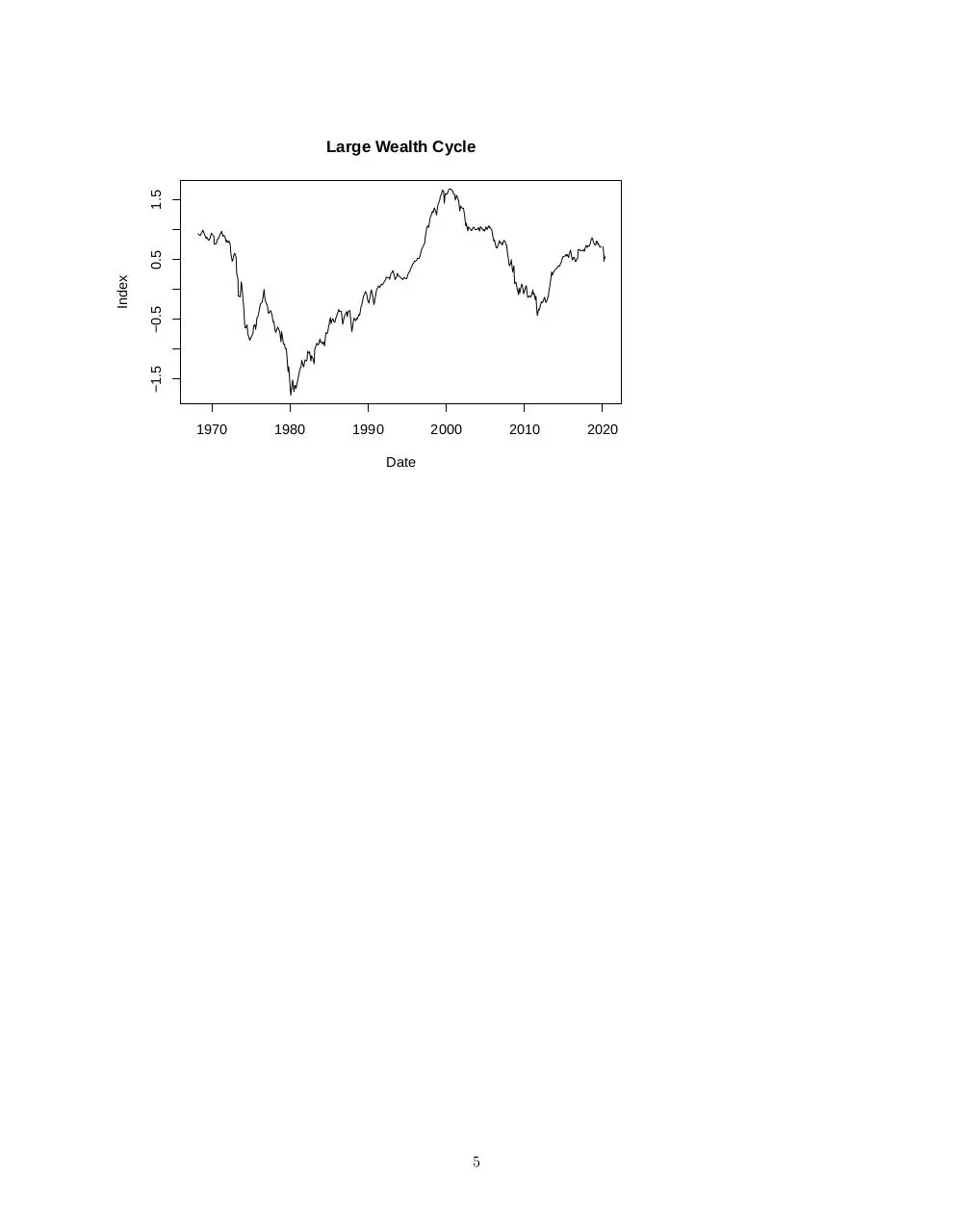
Larger Wealth Cycle View.
This chart is a large view of the weath cycle between equities and gold. The privious chart is more important
because it will allow you to catch the pull-backs on this larger cycle.
Last Date and Chart:
2020-05-01
4
−0.5
−1.5
Index
0.5
1.5
Large Wealth Cycle
1970
1980
1990
2000
2010
Date
5
2020
Crash leading Indicators.
OIS 3year - 2year forwards rate:
Based on research by JP Morgan:
(note: may also use ‘OIS 2y -1y forwards rate’ for earlier indication.)
https://www.zerohedge.com/news/2018-12-01/jpmorgan-spots-rare-and-even-worse-omen-market
The Overnight Index Swap rate (OIS) is more market influenced than Fed funds rate. Using it to calculate
the 3year forward rate and the 2year forward rate should lower the impact of negeative interest rates which
can have adverse effects. Also since the OIS is used to calculate both the 2year and 3year forward rates, any
difference in the OIS affects both. Combined with the fact that the 2year and 3year yields are found close
together on the yield curve, then any ‘yield curve control’ on short and long dated treasuries should have
minimal impact.
IMPORTANT! - When it turns below 0 then sell all investments and go to cash. Wait for the ‘Getting back
in’ indicators to tell you when to get back into the market and in what direction of the wealth cycle.
I suspect that unlike traditional ‘yield spread indicators’, for example the ‘10y-2y treasury spread’, this
indicator should work in a period similar to 1930 - 1965, inwhich there were 6 recessions without an inversion.
However this theory is yet to be tested.
Based on report date:
2020-04-01
0.2
0.0
−0.2
Index
0.4
0.6
OIS 3y−2y Forwards Spread
1980
1990
2000
2010
Date
KKT Index:
Based on research from MIT and State Street:
by William B. Kinlaw, Mark Kritzman, David Turkington
https://papers.ssrn.com/sol3/papers.cfm?abstract_id=3521300
https://www.windhamcapital.com/academic-research/
6
2020
This indicator is a comformation indicator to be used with the ‘OIS 3y-2y forward’ indicator. Both the ‘OIS
3y-2y forward’ and ‘KKT index’ are forward leading indicators, however the ‘OIS 3y-2y forward’ can lead by
3 months to 3 years, where as the ‘KKT index’ has shown to lead by 1-3 months (the indicator is built using
monthly data so it may also lag by 1 month). Both indicators should work even if there is no inversion of the
‘10y-2y yield spread’ due to ‘yield curve control’.(like the period 1930 - 1965)
The ‘KKT Robust+Recession’ is added because a second type of crash can occur through an over exuberant
growth period then correcting through a reversion to the mean. An example of this occured in 1987, if you
got out when the indicator was over 80% you would of missed the 1987 crash by 1 month.
Based on report date:
2020-04-01
60
40
20
Index
80
100
KKT index
1990
2000
2010
Date
7
2020
40
20
0
Index
60
80
KKT Robust+Recession
1990
2000
2010
Date
8
2020
Getting Back-in Indicators.
Cash Reductions across Investor Sentiment:
The chart below is created from data collected at the “American Association of Individual Investors”. It sends
out an “Asset Allocation Survey” which which collects the percentage of holdings between stocks, bonds
and cash of millions of investors. We look for a 10% reduction of cash holdings showing most investor have
increased risk and entered the markets again.
The American Association of Individual Investors is a nonprofit education publisher that helps hundreds of
thousands (+2,000,000) of individual investors achieve their financial goals. It is an independent, nonprofit
corporation formed for the purpose of assisting individuals in becoming effective managers of their own assets
through programs of education, information and research.
Based on report date:
2020-04-01
0.6
0.4
0.0
0.2
Index
0.8
1.0
Getting Back In
1990
1995
2000
2005
2010
2015
2020
Date
KKT - Robust:
This chart reflects robustness in the economy and a value over 5 is a good place to enter back into the markets,
but you should always use the ‘Cash Reductions across Investor Sentiment’ indicator to signal getting back
into the markets.
A value over 15 can reflect an over exuberant growth period which may correct by a reversion to the mean (a
crash). You may want to exit the market for a short while and when robust growth is in range again, get
back in.
Based on report date:
2020-04-01
9
10
5
0
Index
15
KKT−Robust
1990
2000
2010
Date
10
2020
Download WealthCycle-example
WealthCycle-example.pdf (PDF, 223.93 KB)
Download PDF
Share this file on social networks
Link to this page
Permanent link
Use the permanent link to the download page to share your document on Facebook, Twitter, LinkedIn, or directly with a contact by e-Mail, Messenger, Whatsapp, Line..
Short link
Use the short link to share your document on Twitter or by text message (SMS)
HTML Code
Copy the following HTML code to share your document on a Website or Blog
QR Code to this page

This file has been shared publicly by a user of PDF Archive.
Document ID: 0001938759.