mcadams portfolio (PDF)
File information
This PDF 1.7 document has been generated by Adobe InDesign CS6 (Macintosh) / Adobe PDF Library 10.0.1, and has been sent on pdf-archive.com on 06/04/2013 at 01:03, from IP address 66.231.x.x.
The current document download page has been viewed 797 times.
File size: 15.83 MB (20 pages).
Privacy: public file


File preview
Kelli Lee McAdams
kleemcadams@gmail.com
(703) 577 9720
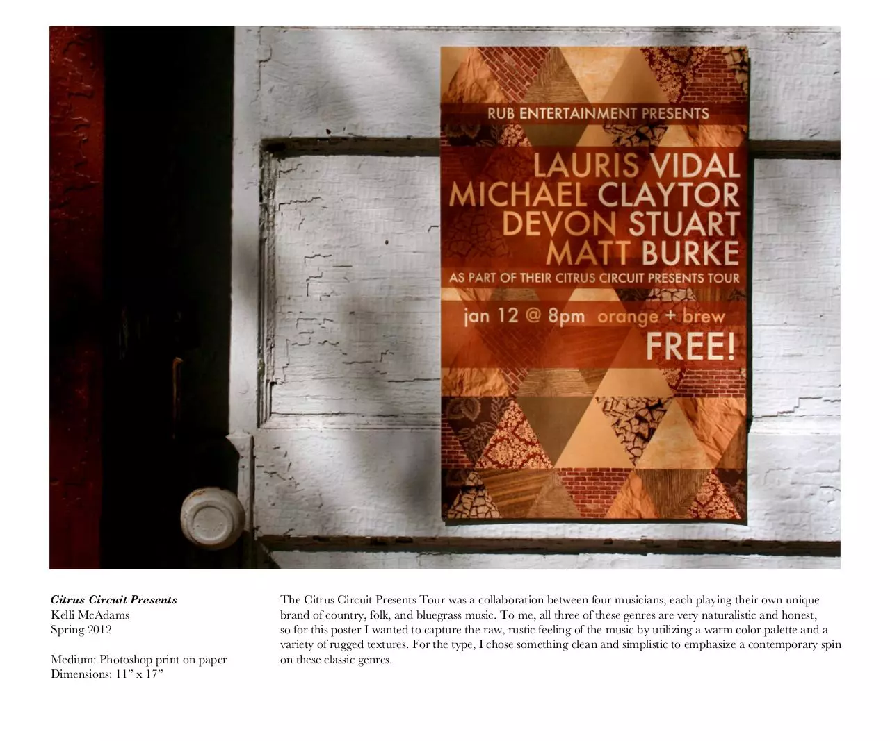
Citrus Circuit Presents
Kelli McAdams
Spring 2012
Medium: Photoshop print on paper
Dimensions: 11” x 17”
The Citrus Circuit Presents Tour was a collaboration between four musicians, each playing their own unique
brand of country, folk, and bluegrass music. To me, all three of these genres are very naturalistic and honest,
so for this poster I wanted to capture the raw, rustic feeling of the music by utilizing a warm color palette and a
variety of rugged textures. For the type, I chose something clean and simplistic to emphasize a contemporary spin
on these classic genres.
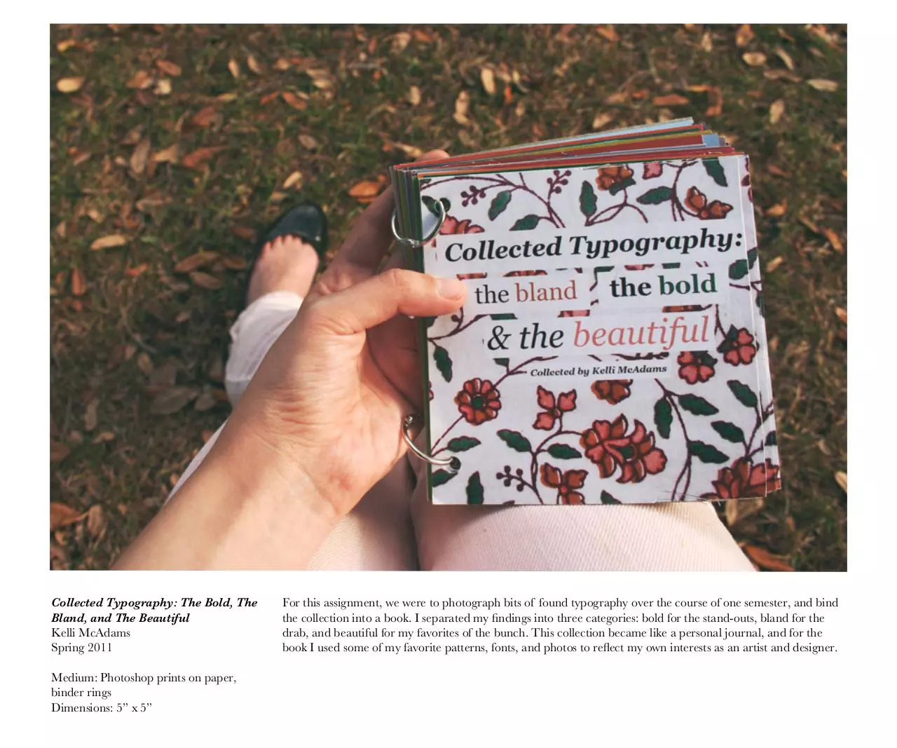
Collected Typography: The Bold, The
Bland, and The Beautiful
Kelli McAdams
Spring 2011
Medium: Photoshop prints on paper,
binder rings
Dimensions: 5” x 5”
For this assignment, we were to photograph bits of found typography over the course of one semester, and bind
the collection into a book. I separated my findings into three categories: bold for the stand-outs, bland for the
drab, and beautiful for my favorites of the bunch. This collection became like a personal journal, and for the
book I used some of my favorite patterns, fonts, and photos to reflect my own interests as an artist and designer.
Collected Typography: The Bold, The
Bland, and The Beautiful (Detail)
Leilani
Kelli McAdams
Fall 2012
Medium: Illustrator; printed on textured
paper
Dimensions: Various
Leilani is a brand identity that I developed for a line of specialty gourmet products from Hawaii, including
kukui nut soap, macadamia nut cooking oil, and a macadamia nut chocolate bar. Working with the theme of
Hawaiian culture, I wanted to create a visual identity that references the vintage kitsch aesthetic of a postcardperfect Hawaii, but still conveys the sensibility of an upscale and quality product.
Leilani (Detail)
100 Squares Book: Hole
Kelli McAdams
Fall 2011
Medium: mixed media on paper (found
papers, acrylic, watercolor, pen, colored
pencil, digital prints, sequins, etc)
Dimensions: 3” x 9” (each square is 3” x 3”)
For this assignment, we were to pick a single word and visually represent that word in one hundred different
ways. The word I chose was hole. I explored this choice in great detail, implying everything from a literal hole
in the ground to the hole as a metaphorical absence. I experimented with cut-outs and layering to go one step
further with my concept by putting holes in the squares themselves.
100 Squares Book: Hole (Detail)
Cover: The Fine Print
Kelli McAdams
Fall 2011
Medium: drawn first with pen, then
digitally edited and printed on newsprint
Dimensions: 8.5” x 11”
This is an illustration I did for the cover of The Fine Print, a local news magazine. The magazine is published
seasonally, and my job was to do a drawing with a wintery theme. The magazine itself has a handmade, zine-like
quality, with lots of sketchy images and bold articles, so I decided to do something very illustrative in a drawing
style reminiscent of graphic novels.
Note: I am responsible only for the illustration. The page layout was designed by the staff of The Fine Print.
Paynes Prairie Poster
Kelli McAdams
Fall 2012
Medium: Photoshop and Illustrator;
printed on cardstock
Dimensions: 18” x 24”
This poster for Paynes Prairie is meant to emphasize the natural beauty of the park, particularly within the
botanical realm. I wanted to create an eye-catching advertisement that retained the aesthetic beauty of the park
itself. The design features a collage of illustrations taken from the Rare Books Library here at UF, most of them
done by renowned explorer and horticulturist John Bartram during his time in Alachua County.
Paynes Prairie Poster (Detail)
Book: The Girl from Fruit Tree Beach
Kelli McAdams
Spring 2011
Medium: InDesign and scanned
watercolor images printed on paper,
bound with white thread
Dimensions: 5” x 7” (closed)
I take inspiration from old storybooks and fairytales, and for this project, I wanted to really indulge these
fascinations by creating my own storybook, complete with illustrations. I chose a serifed font for a quaint
aesthetic, and made the book itself small and light for a more intimate reading experience. A warm palette,
cream paper, and a stitched bind lend a handcrafted, vintage feel to reference the antiquated art of storybooks.
Book: The Girl from Fruit Tree Beach (Detail)
Figure/Ground Squares: Harry Potter
Kelli McAdams
Fall 2011
Medium: black construction paper on
white paper
Dimensions: 48” x 40” (each square is 8” x 8”)
This project explores the relationship between foreground and background using nothing but black strips of
paper. I wanted to do something recognizable with my project, so I chose to represent my own interpretation of
the world of Harry Potter. I aimed to show the dynamic between figure and ground by playing with whimsical
images and interesting compositions, and pushed myself to create complex forms under the given restrictions.
Figure/Ground Squares: Harry Potter (Detail)
SHELF Magazine
Kelli McAdams
Fall 2012
Medium: InDesgin print on cardstock and
perfect bound
Dimensions: 5” x 8.5”
SHELF MAG is geared towards the college student and/or twenty-something who has always loved to read, but
can’t seem to find time for it in his/her busy day-to-day. SHELF features up-to-date literary content (book news,
reviews, short stories) presented in a smart, contemporary way, and provides young, busy people with a monthly
dose of good, old-fashioned readin’ to get them back in the book-loving grind.
SHELF Magazine (Detail)
SHELF Magazine (Detail)
Les Annees De L’affiche
Kelli McAdams
Spring 2011
Medium: Photoshop print on paper
Dimensions: 11” x 17”
This design advertises my proposal for an informative lecture series based on the French Art Nouveau
movement. The event would focus specifically on the posters of the time, which combined decorative images
with elegant lettering. I wanted to echo the movement’s key elements by emphasizing the title with elaborate,
illustrative text and a lot of ornamentation, but to keep the body of the poster simple, clean, and readable.
Les Annees De L’affiche (Detail)
Download mcadams portfolio
mcadams_portfolio.pdf (PDF, 15.83 MB)
Download PDF
Share this file on social networks
Link to this page
Permanent link
Use the permanent link to the download page to share your document on Facebook, Twitter, LinkedIn, or directly with a contact by e-Mail, Messenger, Whatsapp, Line..
Short link
Use the short link to share your document on Twitter or by text message (SMS)
HTML Code
Copy the following HTML code to share your document on a Website or Blog
QR Code to this page

This file has been shared publicly by a user of PDF Archive.
Document ID: 0000099810.