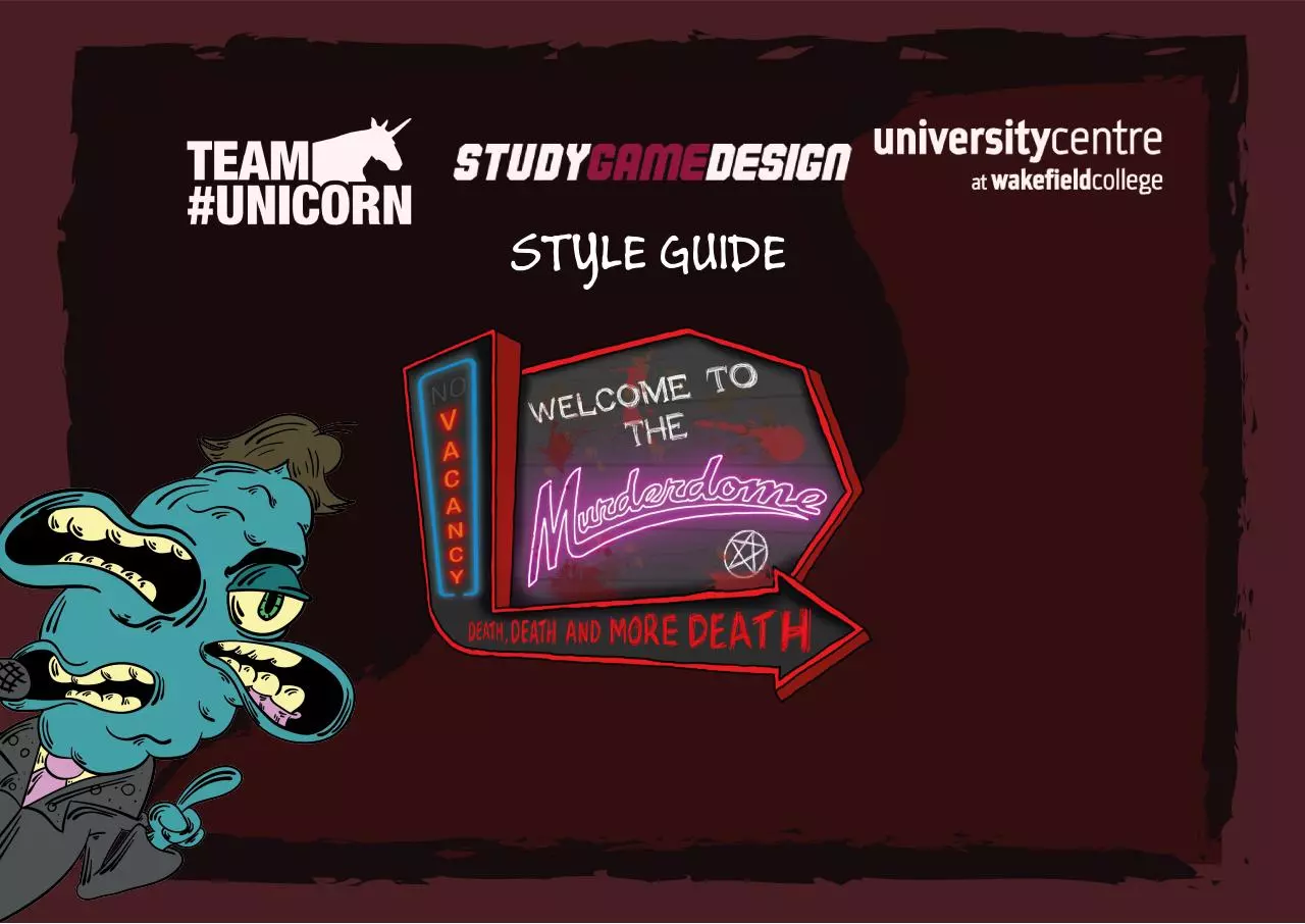
Style Guide (PDF)
File information
This PDF 1.4 document has been generated by Adobe InDesign CC 2014 (Windows) / Adobe PDF Library 11.0, and has been sent on pdf-archive.com on 05/04/2016 at 10:25, from IP address 194.82.x.x.
The current document download page has been viewed 500 times.
File size: 11.19 MB (20 pages).
Privacy: public file


File preview
STYLE GUIDE
INTRODUCTION
Murderdome is a vehicular combat game in which players must compete in a post-apocalyptic
gameshow to see who will be the last to survive.
2
The central theme of the game is being over the top, with over the top mechanics and
characters based around both tattoo art and culture and Americana of the 60s and 70s.
Monsters of different American 60s culture themed racing teams compete to see who can kill the
most, and the most spectacularly, under the barbaric Murderdome.
As such the style itself is over the top, taking inspiration from heavy metal art, tattoo art, and
underground comics to create a unique, nasty look.
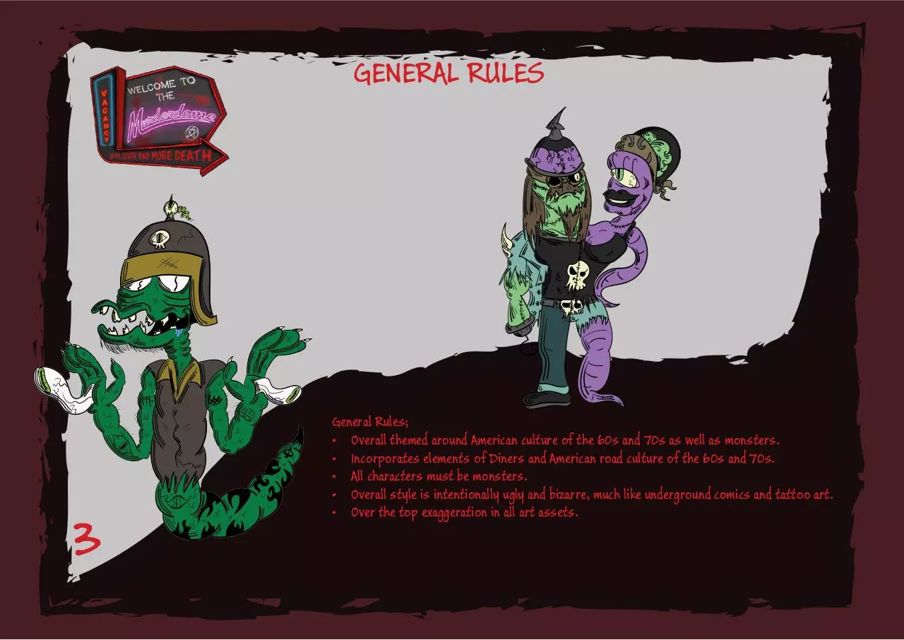
GENERAL RULES
3
General Rules;
• Overall themed around American culture of the 60s and 70s as well as monsters.
• Incorporates elements of Diners and American road culture of the 60s and 70s.
• All characters must be monsters.
• Overall style is intentionally ugly and bizarre, much like underground comics and tattoo art.
• Over the top exaggeration in all art assets.
LOGO
131, 1, 1
#830101
255, 0, 0
#FF0000
243, 8, 235
#F308EB
216, 216, 216
#D8D8D8
59, 59, 59
#3B3B3B
4
The Logo must;
• Use the Flottflott Regular typeface, this can not be changed.
• “Murderdome” must have a capital M, and no space.
• The logo’s neon aesthetic can not be changed in the full logo.
• The text may be used independently of the image, and in black and white, but not vice-versa.
• The sign’s shape cannot be edited, neither can the arrow.
• Shadows can be changed to follow direction of light. (For example, if used as a 3D model, or
a poster)
• The sign image may have rust, and wear and tear, but not to the extreme. Ask the Art Lead if
you think it may be.
TEAM LOGOS
108, 94, 62
#6C5E3E
138, 130, 114
#8A8272
166, 156, 130
#A69C82
1, 1, 1
010101
5
Team Logos must;
• Team names cannot be changed.
• Typefaces reflect the theme of the team, for example, Bikers may use something similar to a
heavy-metal band logo, or Hells Angels jacket.
• The visuals of team logos must reflect the culture the team is based on, as well as featuring
the game’s monster twists, for example, a Biker logo would feature a skull.
• Colours used must be themed towards the team, for example black and red, or black and
white for Bikers.
• The team name must be clearly visible, and be the focus, as these logos may potentially be
used on small 3D art assets.
USER INTERFACE
131, 1, 1
#830101
255, 0, 0
#FF0000
243, 8, 235
#F308EB
216, 216, 216
#D8D8D8
59, 59, 59
#3B3B3B
6
The UI must;
• Buttons must follow Typeface rules for their typefaces.
• All elements must reference the American Diner, and cannot be themed to the other elements
such as specific teams.
• Be quirky, and assymetrical. Imperfection is key, with interesting, odd angles, rather than
straight and bland.
• Colours may be bright, but the typeface inside must be clear and easy to read, without colour
distracting from that.
HUD
131, 1, 1
#830101
255, 0, 0
#FF0000
243, 8, 235
#F308EB
216, 216, 216
#D8D8D8
59, 59, 59
#3B3B3B
7
The HUD must;
• All UI elements must stay in the order they are shown on the example HUD.
• Must stick to an American Diner theme, for example, Neon Signs.
• Colours can be changed to accompany character and team specific traits.
• Characters and the announcer pop up from the bottom for animations.
• Sizes must accompany the size of the screen, no element should cover more than 20% of
screen space.
• Any in-game HUD animation or colour changes must have context to them, for example, when
the player gets an item, the itembox may blink or glow.
• Animations and effects cannot be large and over-distracting, however.
TYPEFACES
Typefaces;
• Headers uses Harlow Solid Italic.
• Sub-headers use SketchFlow Print.
• Body Text and Buttons use Buxton Sketch.
8
ABCDEFGHIJKLMNOPQRSTUVWXYZ
abcdefghijklmnopqrstuvwxy
ABCDEFGHIJKLMNOPQRSTUVWXYZ
abcdefghijklmnopqrstuvwxyz
ABCDEFGHIJKLMNOPQRSTUVWXYZ
abcdefghijklmnopqrstuvwxyz
COLOURS
131, 1, 1
#830101
97, 76, 105
#614C69
9
255, 0, 0
#FF0000
84, 75, 51
#544B33
47, 74, 76
#2F4A4C
248, 243, 168
#F8F3A8
135, 195, 129
#87C381
249, 245, 232
#F9F5E8
59, 59, 59
#3B3B3B
Colours Must;
• Never be white (#FFFFFF), if you were going to use white, use an off-white instead, tinted to
a colour that matches the element you’re colouring. (Green monster, green tint, etc)
• Generally be light pastel, dark or pale, apart from red (#FF0000), which is the only colour
that may be used that brightly.
• Colours on this page are merely a suggestion, if you follow the rules above, you may use
any colour that fits. However, restrain palettes of an element to no more than 6 colours for
a character, 9 for a car, and 12 for an environment. The bigger an element, the more colours
allowed.
Download Style Guide
Style Guide.pdf (PDF, 11.19 MB)
Download PDF
Share this file on social networks
Link to this page
Permanent link
Use the permanent link to the download page to share your document on Facebook, Twitter, LinkedIn, or directly with a contact by e-Mail, Messenger, Whatsapp, Line..
Short link
Use the short link to share your document on Twitter or by text message (SMS)
HTML Code
Copy the following HTML code to share your document on a Website or Blog
QR Code to this page
This file has been shared publicly by a user of PDF Archive.
Document ID: 0000357323.