Designing My War Poster By Daniel Carmichael (PDF)
File information
Title: Microsoft Word - Designing my war poster by Daniel Carmichael.docx
Author: Danny Carmichael
This PDF 1.3 document has been generated by Microsoft Word / Mac OS X 10.6.4 Quartz PDFContext, and has been sent on pdf-archive.com on 11/11/2010 at 01:42, from IP address 81.108.x.x.
The current document download page has been viewed 989 times.
File size: 4 MB (7 pages).
Privacy: public file
File preview
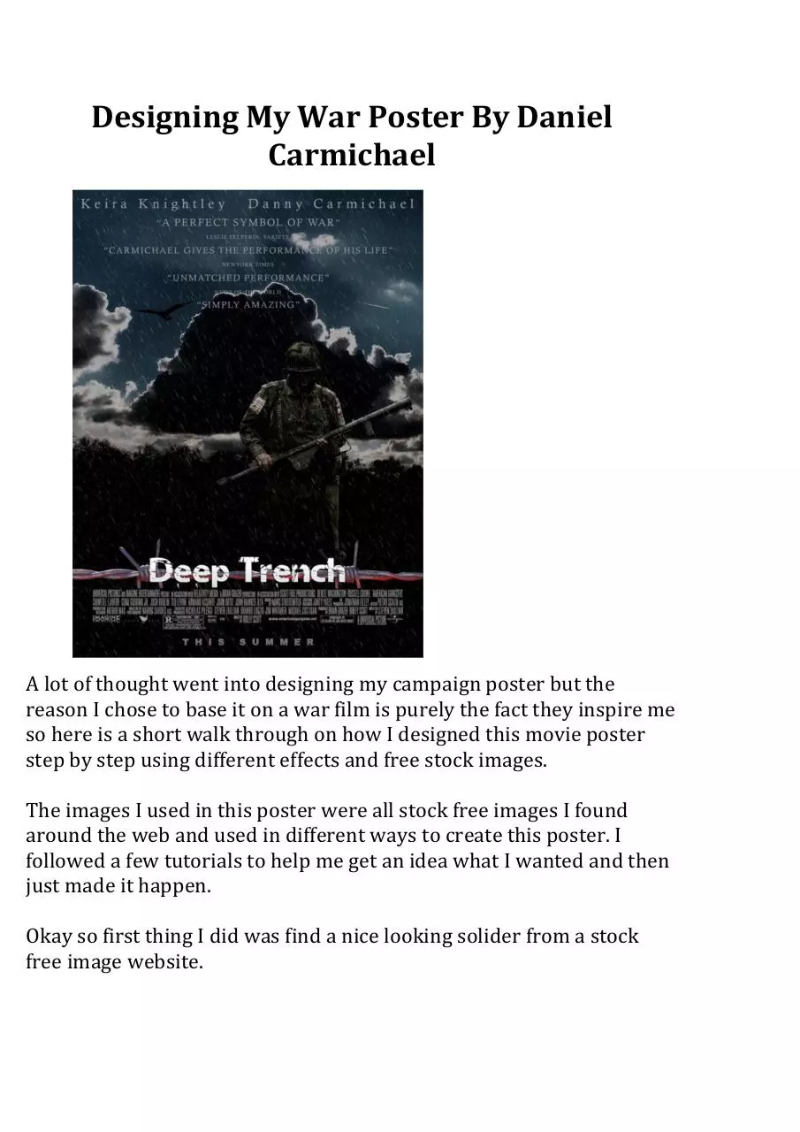
Designing My War Poster By Daniel
Carmichael
A lot of thought went into designing my campaign poster but the
reason I chose to base it on a war film is purely the fact they inspire me
so here is a short walk through on how I designed this movie poster
step by step using different effects and free stock images.
The images I used in this poster were all stock free images I found
around the web and used in different ways to create this poster. I
followed a few tutorials to help me get an idea what I wanted and then
just made it happen.
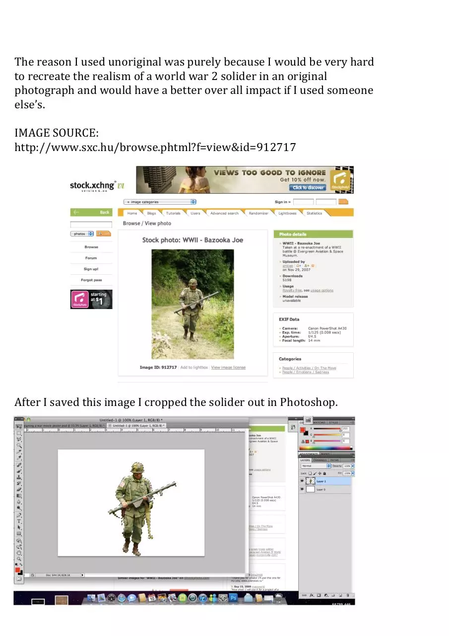
Okay so first thing I did was find a nice looking solider from a stock
free image website.
The reason I used unoriginal was purely because I would be very hard
to recreate the realism of a world war 2 solider in an original
photograph and would have a better over all impact if I used someone
else’s.
IMAGE SOURCE:
http://www.sxc.hu/browse.phtml?f=view&id=912717
After I saved this image I cropped the solider out in Photoshop.
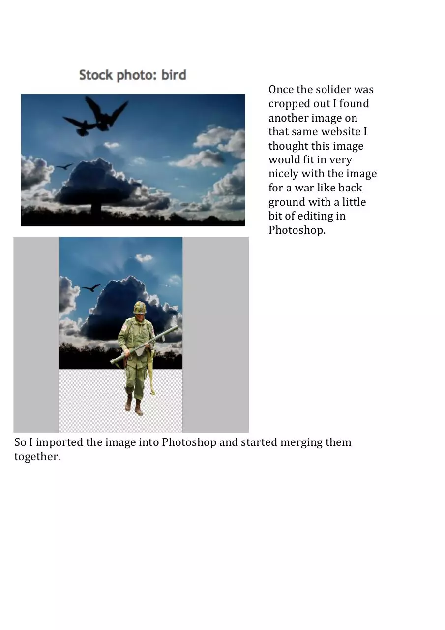
Once the solider was
cropped out I found
another image on
that same website I
thought this image
would fit in very
nicely with the image
for a war like back
ground with a little
bit of editing in
Photoshop.
So I imported the image into Photoshop and started merging them
together.
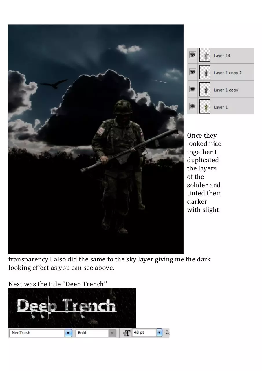
Once they
looked nice
together I
duplicated
the layers
of the
solider and
tinted them
darker
with slight
transparency I also did the same to the sky layer giving me the dark
looking effect as you can see above.
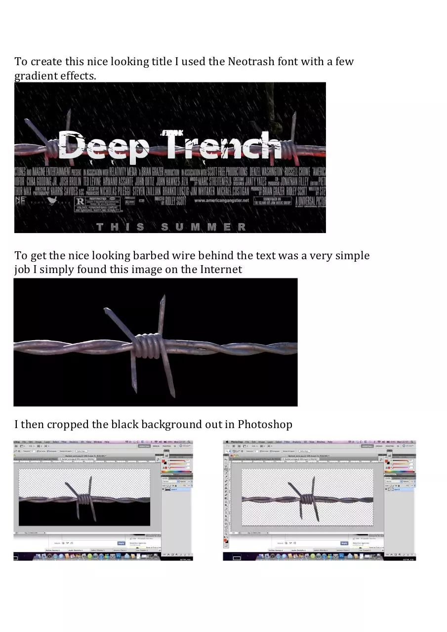
Next was the title ‘’Deep Trench’’
To create this nice looking title I used the Neotrash font with a few
gradient effects.
To get the nice looking barbed wire behind the text was a very simple
job I simply found this image on the Internet
I then cropped the black background out in Photoshop
After this was done I dragged it behind the title and duplicated the layer.
I they changed the HUE/Saturation and give it a red tint to give it that
nice effect of blood.
And finally using filters I added the rain in the background. And the
reviews in the top in another font. Thank you for reading
By Daniel Carmichael
Download Designing My War Poster By Daniel Carmichael
Designing My War Poster By Daniel Carmichael.pdf (PDF, 4 MB)
Download PDF
Share this file on social networks
Link to this page
Permanent link
Use the permanent link to the download page to share your document on Facebook, Twitter, LinkedIn, or directly with a contact by e-Mail, Messenger, Whatsapp, Line..
Short link
Use the short link to share your document on Twitter or by text message (SMS)
HTML Code
Copy the following HTML code to share your document on a Website or Blog
QR Code to this page

This file has been shared publicly by a user of PDF Archive.
Document ID: 0000027303.