FavourBrandingGuide (PDF)
File information
This PDF 1.4 document has been generated by Adobe InDesign CC 2015 (Windows) / Adobe PDF Library 15.0, and has been sent on pdf-archive.com on 28/09/2016 at 09:42, from IP address 110.20.x.x.
The current document download page has been viewed 281 times.
File size: 741.33 KB (14 pages).
Privacy: public file


File preview
f avour
Revolutionising Food Delivery
Brand Identity Guide
Lewis Monson - 5122
1
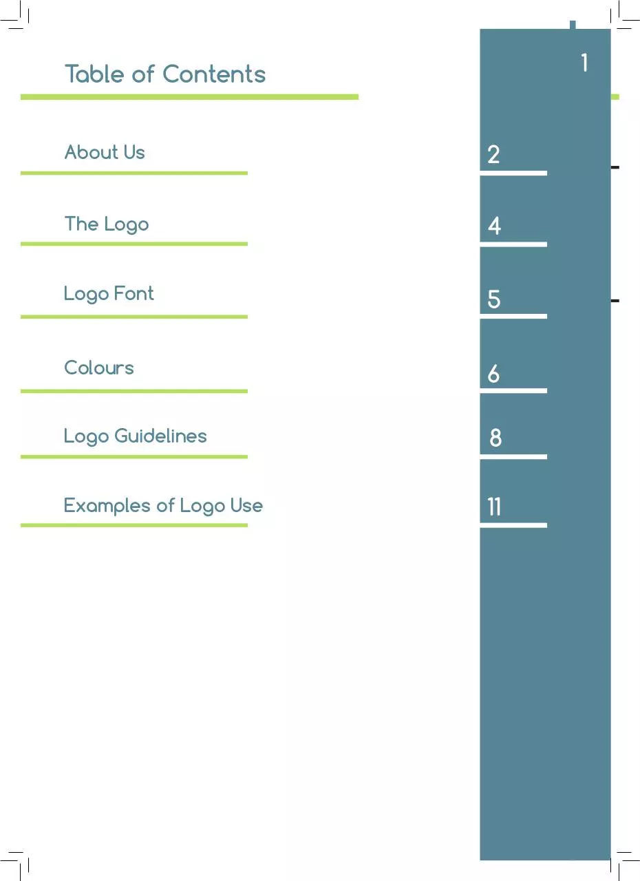
Table of Contents
About Us
2
The Logo
4
Logo Font
5
Colours
6
Logo Guidelines
8
Examples of Logo Use
11
About Us
About Us
We are a management platform for food businesses to
find drivers and help the growth of their business with a
simple and flexible system. Helping both the business and
the driver.
What We Do
We’re a friendly and helpful company who hopes to
build a reliable company through Favour. Trying to
understand each businesses needs as well as
understanding the drivers to create a happy
community. With a blanace between being a
pproachable and relaxed, with knowing when we need
to work hard and deliver on our promises.
2
3
About Us
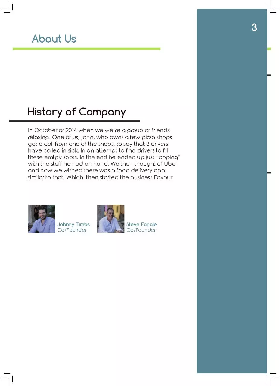
History of Company
In October of 2014 when we we’re a group of friends
relaxing. One of us, John, who owns a few pizza shops
got a call from one of the shops, to say that 3 drivers
have called in sick. In an attempt to find drivers to fill
these emtpy spots. In the end he ended up just “coping”
with the staff he had on hand. We then thought of Uber
and how we wished there was a food delivery app
similar to that. Which then started the business Favour.
Johnny Timbs
Co/Founder
Steve Fanale
Co/Founder
The Logo
4
Idea Behind the Logo
The idea behind this logo is attempting to combine both the
food businesses, as well as the drivers similar ot Uber.
Combining both the words flavour, and favour, but while
hinting at the word flavour with the lighter coloured line in the
middle. As the company highlights the fact that its building
a community of Drivers and Busininesses, I felt that this logo
incorporates both sides well.
As for the taglinge” revolutionising food delivery”. I felt that it
needed to be obvious about their goals, and that it is a new
idea for the modern age.
Variations
favour
f avour
f avour
Revolutionising Food Delivery
The name by itself
should be used for
websites, or of course
if you want to use the
name. Some people
might accidently call
the company Flavour
This is the basic logo
which can be used
for most situations.
Business cards, in
corners of paper, or
any other situation
which you may seem
fitting
This is the logo with
the tagline. Which
should be used on
apps, or maybe
when entering a
website. In
conjunction with just
the name by itself
Logo Font
5
Primary Font
Comforta Bold
abcdefghijklmnopqrstuvwxyz
ABCDEFGHIJKLMNOPQRSTUVWXYZ
Comforta Bold
specfiically can be
used for headings
usually. As for the
other 2 styles they
can be used for
subtitles.
Comforta Regular
abcdefghijklmnopqrstuvwxyz
ABCDEFGHIJKLMNOPQRSTUVWXYZ
Comforta Light
abcdefghijklmnopqrstuvwxyz
ABCDEFGHIJKLMNOPQRSTUVWXYZ
Secondary Font
Rounded Elegance
abcdefghijklmnopqrstuvwxyz
ABCDEFGHIJKLMNOPQRSTUVWXYZ
Rounded Elegance
can be used as
normal text. Without it
looking too dull at the
same time, as well as
it suits Comforta
6
Brand Colours
Primary Colour
CYMK
5B8A9A
RGB
91, 138, 154
The primary colour
being a calming
blue. Both shows
professionalism as
well as the
welcoming and
helpful nature of the
company.
Secondary Colours
CYMK
C8D86D
RGB
200, 217, 109
CYMK
2B2B2A
RGB
43, 43, 43
CYMK
FAD96D
RGB
251, 217, 109
CYMK
F4A691
RGB
245, 167, 145
These are the
secondary colours,
the green especially
can compliment the
blue. But the rest can
be used for
advertisements or
promotions.
7
Logo Colours
CYMK
f avour
RGB
Primary
5B8A9A
Secondary
C9D96C
91, 138, 154
201, 217, 108
f avour
Blue and green both
show professionalism
as well as your
approachable
nature. The green
in the middle also
doesn’t stand out as
much as the blue, to
still keep the name
Favour there.
Revolutionising Food Delivery
f avour
CYMK
RGB
434343
2B2B2A
or
or
020203
000000
f avour
Delivering Food Fast
f avour
f avour
Delivering Food Fast
CYMK
RGB
255, 255 ,255
FFFFFF
Black and white
versions of the
logos should be used
if the coloured
version does not. Or
as watermarks if
needed, as the white
one will look appealing on pictures,
examples will be
shown later.
8
Logo Guidelines
Blue and green both
show professionalism
as well as your
approachable
nature. The green
in the middle also
doesn’t stand out as
much as the blue, to
still keep the name
Favour there.
Size Range
f avour 30mm
30mm
f avour
150mm
150mm
Average Size
f avour
Image not to scale
This is the average
size for the logo. It is
just the middle of the
size range at 75mm
75mm
75mm
Image not to scale
Download FavourBrandingGuide
FavourBrandingGuide.pdf (PDF, 741.33 KB)
Download PDF
Share this file on social networks
Link to this page
Permanent link
Use the permanent link to the download page to share your document on Facebook, Twitter, LinkedIn, or directly with a contact by e-Mail, Messenger, Whatsapp, Line..
Short link
Use the short link to share your document on Twitter or by text message (SMS)
HTML Code
Copy the following HTML code to share your document on a Website or Blog
QR Code to this page

This file has been shared publicly by a user of PDF Archive.
Document ID: 0000487716.