Manmade CO2:
Effects and Solutions in the Big Picture
Version 1.5 – August 2020
Eric D. Peterson
All original content in this document is hereby placed in the public domain. All other
content is protected by the owners’ copyrights and used under fair use. Please contact
eric654@icloud.com for any content or copyright issues.
Support: I was not paid for this work, and don’t want donations. If you donate, please
use my bitcoin address: 148Y9qRPJNaQ86WXcABHgXo2b2EMEejBzo so any payments
and redemptions can be tracked here:
https://www.blockchain.com/btc/address/148Y9qRPJNaQ86WXcABHgXo2b2EMEejBzo
�
Abstract
The arguments that the rise in CO2 is natural or mostly natural are dismissed early in this
whitepaper, but those arguments and many other non-mainstream arguments are included
for completeness. The main focus of the paper is: given the manmade rise in CO2, what
are the effects, what are the current trends in those effects, how we can deal with those
effects, and what are the economic costs of weather and any changes in weather. The last
section is about solutions, some of which are obvious, some not so obvious, and some
that people might view as overly optimistic. But that section also gives the reasons to be
optimistic.
The three major effects are the drop in ocean pH, sea level rise, and changes in weather.
Ocean pH is dropping with a variety of projected effects and some uncertainty. There is
currently a small acceleration in sea level rise, but there has been acceleration and
deceleration in the past from natural factors that are still present. Those factors will
speed up and slow down a rise that is now mainly manmade.
Global warming has three main weather effects: increased rainfall, hurricanes (which also
include rainfall) and heat waves. Other effects are described but are not important or
currently declining. Although “heavy” rainfalls are increasing, “extreme” rainfalls of
durations of a day or less are not. There is one category of extreme rainfalls that is
increasing in frequency: extreme rainfalls lasting more than a day, especially those
caused by tropical storms and hurricanes. One example is the brand-new state record for
storm total rainfall in Arkansas from hurricane Barry (July 2019). Hurricanes are shown
to have a better chance of turning into major hurricanes, even as the number of hurricanes
drops. Heat waves in the US are now approaching levels last seen in the 1930’s.
Those harmful changes in weather need to be mitigated as demonstrated by the failures,
e.g. France in 2003. Various technological solutions and social policies are required to
successfully deal with bad weather whether made worse by global warming or not. This
includes understanding why wildfires are getting worse lately, from rainfall in California,
and a typical drought in Australia, and what to do about it: primarily fuel reduction.
Human output of CO2 is accelerating, but human progress is also accelerating and that is
much more important and consequential. There are amazing rises in agricultural yields,
drops in mortality from various weather causes, and a similar drop in economic costs of
weather. Many of the worsening weather effects can be mitigated or alleviated. Other
effects like hurricane damage are being overcome by economic growth. We will have
ever-greater resilience and weather events will be increasingly irrelevant. “Runaway”
warming from positive feedback is implausible.
The relentless and unwanted increases in manmade CO2 will be significantly slowed by
cheap and ubiquitous renewable energy in a few decades, especially by energy sources
that extract CO2 from the atmosphere, e.g. hydrocarbon “solar fuels” such as synthetic
methane. By the end of the century we will have unimaginable inventions for energy
generation and efficiency. We can have a global network of CO2-neutral energy sources
based on large scale solar fuel farming, complemented by sequestration wherever that can
be accomplished and funded.
�
1.
FIRST AND SECOND ORDER EFFECTS ......................................................................... 1
1.1. MANMADE CO2 .................................................................................................................... 1
1.1.1. ELIMINATING CO2 STARVATION ..................................................................................... 2
1.1.2. OCEAN ACIDIFICATION..................................................................................................... 3
1.1.3. GREENING (CO2 FERTILIZATION) ................................................................................... 6
1.1.4. GLOBAL WARMING ........................................................................................................... 6
2.
THIRD ORDER EFFECTS ................................................................................................... 9
2.1. SEA LEVEL RISE ................................................................................................................... 9
2.1.1. SEA LEVEL RISE FROM THERMAL EXPANSION............................................................... 9
2.1.2. SEA LEVEL RISE FROM GREENLAND MELT .................................................................. 10
2.1.3. SEA LEVEL RISE FROM ANTARCTIC MELT ................................................................... 14
2.1.4. LOCAL SEA LEVEL FACTORS ......................................................................................... 15
2.2. EXTREME WEATHER.......................................................................................................... 16
2.2.1. “EXTREME” RAINFALL ................................................................................................... 16
2.2.2. FLASH FLOODS ................................................................................................................ 19
2.2.3. HURRICANES .................................................................................................................... 22
2.2.4. TORNADOES ..................................................................................................................... 26
2.2.5. JET STREAM OR WEATHER PATTERN CHANGES .......................................................... 28
2.2.6. HEAT WAVES ................................................................................................................... 31
2.2.7. DROUGHT ......................................................................................................................... 33
2.2.8. EXTREME WINDS............................................................................................................. 36
2.2.9. COLD OUTBREAKS .......................................................................................................... 37
2.2.10. HAIL ............................................................................................................................... 38
2.3. OTHER ATTRIBUTIONS AND PREDICTIONS....................................................................... 40
2.3.1. AGRICULTURE ................................................................................................................. 40
2.3.2. HUMAN MORTALITY ....................................................................................................... 45
2.3.3. CLIMATE REFUGEES ....................................................................................................... 52
2.3.4. WILDFIRE IN CALIFORNIA AND AUSTRALIA ................................................................. 54
2.3.5. EXTINCTIONS ................................................................................................................... 57
2.3.6. POSITIVE FEEDBACKS (E.G. ALBEDO, METHANE) ........................................................ 58
2.4. ECONOMIC IMPACTS .......................................................................................................... 61
3.
3.1.
3.2.
3.3.
3.4.
4.
SOLUTIONS ......................................................................................................................... 66
RENEWABLE ENERGY ........................................................................................................ 67
RESEARCH AND DEVELOPMENT ........................................................................................ 71
MITIGATION AND RESILIENCE .......................................................................................... 73
SOME IDEAS FOR COMING DECADES ................................................................................ 74
BIBLIOGRAPHY ................................................................................................................. 79
�
1. First and Second Order Effects
1.1. Manmade CO2
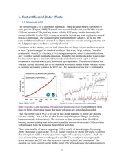
The current rise in CO2 is essentially manmade. There are large natural rises noted in
some proxies (Wagner, 1999). If natural rises occurred in the past, couldn’t the current
CO2 rise be natural? Beyond any issues with the CO2 proxy used in that study, the
answer is that the level of CO2 is rising at a rate far beyond any what any known natural
process can produce. The ocean probably warmed naturally about 1C in the last 500
years and that would lead to about a 5 to 10 ppm total rise over the ensuing centuries, not
the 2.5 ppm rise per year that is currently observed.
Sometimes on the internet, you can find claims that one large volcano produces as much
or more “greenhouse gas” as mankind produces. But a very large volcano, Pinatubo,
produced 42 Mt of CO2 (Gerlach, 1999) during its eruption, which is about half of one
day’s worth of current manmade emissions. Pinatubo also produced a lot of water vapor
but that water vapor is transient and manmade and volcanic water vapor is trivial
compared to the total water cycle, dominated by evaporation. There is no evidence that
volcanic activity increased just as the industrial revolution started or that volcanic activity
is currently increasing to match the CO2 rise. An apparent volcanic rise is explained in
Figure 1 Rise in CO2
Figure 2 No rise in volcanoes (see explanation)
https://volcano.si.edu/faq/index.cfm?question=historicalactivity The explanation boils
down to better observation means that more volcanoes are noticed and recorded.
Thus, the current rise in CO2 is not due to past ocean warming or recent and ongoing
volcanic activity. Nor is it due to other known major biosphere changes (excluding
known manmade deforestation). The rise must be from manmade from fossil fuel
burning, cement making, and deforestation, and the amount of increased CO2 correlates
with estimates from the economic data of those activities.
There are a handful of papers suggesting CO2 is mostly of natural origin (Hertzberg,
2016) “Segalstad’s study of the 13C/12C isotope ratios to be shown in Figure 7 confirms
that atmospheric CO2 is mainly of oceanic origin and not from fossil fuels.” And “An
issue of critical importance with regard to the IPCC’s paradigm is the origin of the
recent increases in CO2. Are they natural or caused by fossil fuel combustion? The
question has been covered earlier in this paper. The preponderance of evidence suggests
1
�
that human emission is not a significant factor in the increase. Indeed, as shown below,
previous IPCC publications, which are no longer available online, calculated human
CO2 emissions to be around 4–5% of the global total (Figure 6).”
These theories, and the particular quantity of “3.4 percent” find their way into internet
websites. The “3.4 percent” claim is sometimes attributed to Dr Tim Ball and was
publicized by the now-defunct National Center for Policy Analysis around 2007. The
NCPA website (defunct and only available at archive.org) even admits the 3.4% figure is
misleading: “Humans contribute approximately 3.4 percent of annual CO2 emissions.
However, small increases in annual CO2 emissions, whether from humans or any other
source, can lead to a large CO2 accumulation over time because CO2 molecules can
remain in the atmosphere for more than a century.” But on the next page, they use the
3.4% figure to incorrectly conclude that “Humanity is responsible for about one-quarter of 1
percent of the greenhouse effect.”
Natural and mostly seasonal CO2 uptake is large and about equal to natural CO2
production, whereas manmade production is about 30 times smaller than the natural flux,
but manmade CO2 uptake is essentially zero. The bottom line with very little uncertainty
is that the well-documented rise from 280 ppm to over 410 ppm is almost entirely
manmade except for the potential minor amount (~5 ppm) mentioned above. Manmade
CO2 is approaching 45% (and rising) of total atmospheric CO2.
1.1.1. Eliminating CO2 Starvation
Before mankind started adding CO2 to the atmosphere, the earth was in a unique period
of CO2 starvation. This was due mainly to the weathering of newly created mountain
ranges like the Himalayas that extracted CO2 from the atmosphere by the very slow
process of silicate weathering along with more uncertain carbonate weathering (Liu,
2011). The earth also currently has a geographic layout of landmasses that favors a
relatively cold climate with lower CO2 as a result. Note that CO2 extraction by
weathering is a very slow process as high as 0.477 Pg C per year (Liu, 2011) compared to
current manmade production of carbon of 10 Pg C per year. Weathering may result in
recovery from current excess manmade CO2 in as little as 10,000 years (Meissner, 2012).
The result of low CO2 on preindustrial earth is that “the last 6 to 8 Ma of Earth's
terrestrial history are different from the entire previous history of Earth.” (Cerling, 1998)
As that latter paper explains, CO2 starvation caused the evolution of new types of plants
(C4 plants like many grasses, corn, and sugar cane) that were more efficient at extracting
lower concentrations of CO2 from the atmosphere and very large changes in animal life
in response to the vegetation changes. CO2 starvation puts the non-C4 plant life at risk.
Another noteworthy effect of CO2 starvation is our current ice age1 consisting of long
glacial periods and short interglacial periods like the current one. It must be noted
however that the main reason for the current permanent ice is planetary geography. The
isolation of Antarctica makes it an ideal freezer to create and retain ice and help cool the
rest of the planet. While it is better to have a bit more CO2 than CO2 starvation, there is
1
Note that “ice age” is simply defined as a period with large amounts of permanent ice
2
�
such a thing as too much of a good thing. CO2 starvation is history and we have rapidly
entered a period of increasingly excessive CO2. CO2 starvation is a moot issue.
Exponential Decay. There is a popular claim that CO2 persists in the atmosphere for
many thousands of years. That is correct but irrelevant. The ocean absorbs about 3
percent of the “excess” CO2 in the atmosphere each year. Some writeups imply that a
larger percentage of annual CO2 is absorbed, e.g. “This recent relentless rise in
CO2 shows a remarkably constant relationship with fossil-fuel burning, and can be well
accounted for based on the simple premise that about 60 percent of fossil-fuel emissions
stay in the air (NASA, 2019).” But there is essentially no difference between newly
released CO2 and prior excess CO2: it is all absorbed equally.
That roughly three percent (3%) uptake by the ocean is why atmospheric levels will
return half-way back to equilibrium in a few decades in an exponential decay. If we were
to stop producing CO2 tomorrow, the ocean would keep absorbing a few percent of the
“excess” CO2 at an exponentially decaying rate until the excess is about 80% gone in
several thousand years. But much more importantly, the excess would be half gone in
just a few decades. Excess is defined as the amount above equilibrium, although the
equilibrium is shifting higher with more emissions and warming.
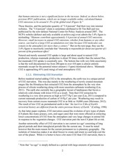
Measurements of radioactive carbon isotopes leftover from nuclear testing show how
CO2 is absorbed by the ocean (Meijer, 1995). There is an exponential decay:
Figure 3 carbon 14 is absorbed by the ocean at
creating an exponential decay curve (a negligible
amount of C14 also spontaneously decays)
That decay means that there will be an
initial rapid drop of CO2 followed by an
increasingly slow drop, likely never
reaching zero extra (preindustrial levels).
But that level was the state of CO2
starvation and we don’t want to go back
to that. Thus, the thousands or 10’s of
thousands of years of very slow decay
are irrelevant. What is also true is that we are not going to stop producing CO2 in the
near future, so the decay rate is moot for the foreseeable future.
1.1.2. Ocean Acidification
As just explained, the ocean steadily absorbs a small percentage of the “excess” CO2 in
the atmosphere even as we increase that excess amount. Based on observations, the
ocean is absorbing increasing amounts of CO2 albeit with a lot of inter-annual variability
(Landschützer, 2014). That ocean uptake is not benign (Doney, 2016).
The pH of the ocean is dropping about 0.02 pH units per decade (D'Olivo, 2015). Note
that the pH around shallow coral reefs has a daily variation of up to 1 pH unit (Shaw,
2012). “The pH of seawater in many coastal environments routinely varies by 1 pH unit
from about pH 7.5 to 8.5.” (Hinga, 2002) The manmade pH drop is small in comparison,
but inexorable. It is predicted to cause declines in calcification and other harmful effects
3
�
in the long run. The lower pH has or will have some detrimental effects, for example,
decreased diversity in coral reefs (Fabricius, 2011).
If the atmospheric increase were natural, then it would most likely be coming from the
ocean, but it is not. The increase in H+ ions, ie. the decrease in pH, means the ocean is
increasing in absorption and decreasing in natural production of CO2. Ocean
acidification means the ocean is absorbing more CO2 than it is releasing on average.
Ocean acidification is sometimes referred to as “the other CO2 problem” (Doney, 2016).
As the paper explains “since preindustrial times, the average ocean surface water pH has
fallen by approximately 0.1 units, from approximately 8.21 to 8.10 (Royal Society 2005),
and is expected to decrease a further 0.3–0.4 pH units (Orr et al. 2005) if atmospheric
CO2 concentrations reach 800 ppmv” The drop has resulted in a reduction of the areas
of the ocean in which aragonite and calcite (mineral forms of calcium carbonate) are
supersaturated. Saturation is a necessary condition for shell and skeleton formation.
Calcium carbonate is formed from CO2 in seawater and calcium from shells and
skeletons. Calcium carbonate is also used to form shells and skeletons. There is a cycle
of calcium carbonate formation and calcification, with solubility varying with
“temperature, salinity, pressure, and the particular mineral phase; aragonite is
approximately 50% more soluble than calcite”. In addition there are other inputs like
trace metals and other nutrients. Also from (Doney, 2016): “Saturation states are highest
in shallow, warm tropical waters and lowest in cold high-latitude regions and at depth,
which reflects the increase in CaCO3 solubility with decreasing temperature and
increasing pressure.”
From (Doney, 2016): “Interestingly, even though global warming may allow corals to
migrate to higher latitudes (Precht & Aronson 2004), the decrease in reef CaCO3
production may restrict reef development to lower latitudes where aragonite saturation
levels can support calcium carbonate accumulation (Guinotte et al. 2003, Kleypas et al.
2001).” That’s something of a chicken and egg problem. The effects on coral (and other
organisms like plankton that also use calcium carbonate) will vary greatly depending on
the amount of dissolved carbonates versus carbonates that sink, precipitate out and fall to
the ocean bottom. The general expectation is that surface waters will become
undersaturated sooner than deeper waters. But biological effects will vary greatly with
both increases and decreases in various life forms as currently observed and anticipated.
One result will be changes in the food web and booms in some life forms and decreases
in others.
The drop of about 0.1 pH unit since preindustrial times is from 8.2 to 8.1 as noted above.
As noted above, a further drop to 7.7 to 7.8 is projected by 2100. Phytoplankton is at the
root of the ocean food chain so naturally there is a concern about the effects of the drop in
pH on phytoplankton. A study (Chen, 1994) shows a drop in phytoplankton growth rates
above pH 8.8 with the study ranging from as low as 7.01 to about 9.3 with the pH
artificially adjusted. There was no drop in growth rates for lower pH.
A review of such studies (Hinga, 2002) points out that the natural range of pH in marine
environments can be wide enough to affect growth. A manmade drop in pH could shift
that range to a lower range of pH depending on the processes that cause the range. The
study notes that “It is not possible to manipulate pH without also affecting some of the
4
�
other components of seawater” requiring a number of different pH control approaches
which only approximate the effects in the real world. Figure 22 from (Hinga, 2002)
shows the results of a meta-study:
Figure 4 - Maxima in phytoplankton growth rate for a range of pH from (Hinga, 2002)
The results show that there are species with growth rates that are relatively sensitive to
changes in pH. There are species that grow in wide ranges of pH. The paper’s
conclusion is that pH is an important factor but just one of many factors.
Many researchers are starting to examine the combination of the two most salient effects
of manmade CO2 which are lower ocean pH and higher ocean temperature. In such
studies the temperature increase is often the more important factor. For example in
(Horn, 2016) the researchers find that warming led to higher growth and an earlier peak
bloom of phytoplankton while those organisms showed a tolerance to higher CO2 (lower
pH). The two factors together had no additive effect on the results.
Finally considering that ocean acidification is a long term problem, and will continue for
several centuries, there are studies to consider if lower pH can be mitigated in the far
future using geoengineering. One motivation is to engineer the ocean to be a bigger sink
for atmospheric CO2, for example by fertilizing ocean surface with iron, thereby using up
the dissolved CO2. The result is slightly less low pH in the surface ocean but a lower pH
in the deep ocean. Those techniques and some techniques to directly raise pH are listed
in (Williamson, 2012).
5
�
1.1.3. Greening (CO2 Fertilization)
On land as in the ocean, higher CO2 increases the growth of vegetation. There is often a
focus on higher growth of particular plants that are bad for humans or the environment.
For example, poison ivy grows better and is more allergenic with increased CO2 (Mohan,
2006). That type of research ignores the fact that beneficial species far exceed nonbeneficial species, and CO2 is rarely selective. The only sustainable way to counteract
unwanted weeds is to encourage alternatives, for example, Virginia creeper, which
benefit just as much from extra CO2 as poison ivy does. In most cases, there is no net
positive or negative effect from increased CO2.
I originally thought that the Japanese Stiltgrass smothering parts of my property in
Virginia was benefitting from CO2 fertilization. But it turns out it was the extra rain, and
instead my invasive Japanese honeysuckle may be benefitting from extra CO2: “High
carbon dioxide levels may negatively affect Nepalese browntop compared to plant
species better able to assimilate extra carbon dioxide. In field experiments in Tennessee,
Belote and others [19] found that in a wet year, Nepalese browntop produced twice as
much biomass under ambient carbon dioxide levels compared to elevated carbon dioxide
levels (P=0.07). In a dry year, there was no significant difference in Nepalese browntop
biomass between carbon dioxide treatments. In contrast, Japanese honeysuckle, a
common nonnative associate of Nepalese browntop, produced 3 times as much biomass
under elevated carbon dioxide levels in both wet and dry years” (Fryer, 2011) I have
many native and invasive species which I have to manage. The ecosystem might be
speeding up from CO2 fertilization, a longer growing season, more rainfall, and other
factors, but the balance in my battle against invasive non-native species or aggressive
native species does not change due to more CO2 or changes in the weather.
Most studies show greening as neutral (balance of positive and negative) for the natural
environment. The CO2 and weather effects on agriculture are discussed later. As an
example of the effect of CO2 fertilization, foliage has increased across many warm, arid
environments (Donohue, 2013).
1.1.4. Global Warming
Increasing CO2 causes global warming, and global warming is the main effect of
increased CO2. For completeness, I will present an argument against the idea that
increasing CO2 causes global warming. There are other more sophisticated arguments
against “back-radiation” and the entirety of the greenhouse effect which I will ignore.
Against: Here’s a link that claims “Evidence Proves That CO2 Is Not A Greenhouse Gas
(Ball, 2018)”. Some evidence is presented such as warming preceding rises in CO2 in the
ice core record. It is true at least in some cases that rising temperature precedes rising
CO2 by 500 to 1000 years. But the page fails to mention that CO2 is an amplifier of
warming. The warming starts by various other causes, the warming causes an initial rise
in CO2, and the rise in CO2 causes more warming. The positive feedback is evident on
most “CO2 lags warming” charts.
Dr. Ball states: “If both factors caused each other to rise significantly, positive feedback
would become exponential. We’d see a runaway greenhouse effect. It hasn’t happened.”
That is true. But that just means there is a weak relationship from warming to CO2
6
�
production and a weak relationship from CO2 production to more warming. Neither of
those positive feedbacks is strong enough to create runaway warming as noted over the
entire history of the earth. The fact of no runaway warming or permanently frozen planet
also means that negative feedbacks dominate at the extremes of heat and cold.
Dr. Ball states: “The assumption that an increase in CO2 causes an increase in
temperature was incorrectly claimed in the original science by Arrhenius. He mistakenly
attributed the warming caused by water vapour (H2O) to CO2. All the evidence since
confirms the error. This means CO2 is not a greenhouse gas. There is a greenhouse
effect, and it is due to the water vapour.” The statement in bold (bold in original) implies
that CO2 is not a radiatively-active gas, but that is not true.
For: Here’s a well-regarded site that explains the effects of increased CO2: thegreenhouse-effect-explained-in-simple-terms/ That page explains that CO2 is a
radiatively-active gas and that adding more molecules of those gases increases the
opacity of the atmosphere in certain wavelengths. In fact, on average an infrared photon,
at a particular wavelength, leaving the earth will be intercepted by a CO2 molecule
within 33 meters to 47 meters2 of the earth’s surface. With more CO2 molecules to hit,
the mean free path decreases which cause an increase in opacity.
Figure 5 The mean free path varies by wavelength
That interception of IR photons by CO2
molecules warms the atmosphere. That
is because the time it takes for the CO2
molecule to conduct the extra heat to the
rest of the atmosphere is many orders of
magnitude shorter than the time it takes
to reemit an IR photon. However, each
CO2 molecule absorbs energy from the
rest of the atmosphere and emits photons
at the same rate as it absorbs photons.
Based on those two physical principles
there is essentially no doubt that
increasing the number of CO2 molecules in the atmosphere will increase the average
temperature of all of the air molecules in the troposphere. That is manmade global
warming.
The unresolved question in the explanation above is the quantity. The fact that more
CO2 molecules produce a warmer atmosphere is a qualitative statement, not quantitative.
Also, the warming effect only works when there is a positive lapse rate, that is, the
temperature decreases with altitude as is the case in the troposphere. As global warming
increases, the lapse rate in the troposphere is expected to decrease and lower the amount
of warming produced by each increment of extra CO2. The quantities must be sorted out
with climate models but climate models can’t predict future weather, only model current
2
dead link: http://www.globalwarmingskeptics.info/attachment.php?aid=250
7
�
weather, modulated by global warming, using parameters that may change with global
warming. Without knowing weather feedback there is no way to know future warming
except within a range of values derived from varieties of possible prevailing weather.
Could global warming be due to increased solar activity? Solar irradiance
reconstructions show a rise in solar irradiation of ~1 W/m2 for the period 1900-1950
(Shapiro, 2011). Divide by 4 since the earth is spherical, multiply by 0.7 since albedo is
0.3 and multiply by 3.7 (per 1C sensitivity) to get 0.05C per 1C of sensitivity. Sensitivity
is defined as the amount of global warming for a doubling of CO2 and a doubling of CO2
produces an extra 3.7 Watts per square meter of the earth’s surface. The sensitivity is a
“high end” long term (century-scale) result, estimated from climate models so it varies
depending on climate model parameters. A 2C sensitivity is considered low, 3C is
consensus, and 4C is high. That means the long-term warming from increased solar
irradiance is roughly 0.1 to 0.2C or 0.15C from 1900 to 1950 using consensus sensitivity.
In (Huber, 2011) the authors concluded that using models with maximum possible
changes in solar irradiance that “solar forcing contributed only about 0.07 ◦ C to the
warming since 1950”.
8
�
2. Third Order Effects
2.1. Sea Level Rise
Often there will be a claim made that sea level rise is accelerating (Church, 2006) which
is true from time to time. The acceleration calculated in that paper requires fitting a
quadratic equation to data that has a lot of natural variation. Although sea level has
natural fluctuations, there is an upward trend that was natural and is now manmade.
There is currently some acceleration but the current peaks are not a lot higher than the
peaks in the trend given in the paper.
Using those modern estimates, the rate of sea-level rise for the past 20 years is only
slightly higher than 1925-1945. Furthermore, the rate of sea level rise is often adjusted
for expansion of the ocean basins. This means the actual, observed rate of sea-level rise
is about 0.3mm/yr slower (GIA adjustment, 2011) than the stated rate of 3.1 mm/yr
(University of Colorado, 2019). Here is Fig 2 from (Church, 2006):
Figure 6 - The rate of sea level rise by the late 1940’s is only marginally less than the rate in the 1990’s
The explanation for the current acceleration is manmade global warming, but what is the
explanation for the acceleration starting in the 1920s? The best complete explanation is
manmade warming is causing sea level rise, but the rate of rise varies naturally.
2.1.1. Sea Level Rise from Thermal Expansion
The ocean as a whole has warmed about 0.2C in the past century. Roughly half of that
warming was natural. As the ocean warms the water expands and raises the sea level.
However, ocean warming is not as simple as observing the atmospheric temperature rise
and assuming the ocean will eventually warm the same amount with a long delay. There
is both colder and warmer water being mixed down from the surface into the deeper
ocean varying by location, season and prevailing weather.
The sea surface temperature (SST) has warmed almost everywhere. But transferring that
warmth to the deeper ocean is an uneven process. The Argo buoy network measures
ocean temperatures at various depths and shows 15 years of warming depicted and linked
below. Much of the recent warming shown in the ocean temperature plot is cyclic
warming from the recent super El Nino shown in the Nino 3.4 graph below that. As the
current El Nino inevitably fades and La Nina takes over, it will be worth watching what
happens to the ocean temperature plot.
9
�
Figure 7 - Average ocean temperature at depths measured by Argo (source)
Figure 8 Much of the short-term ocean warming shown above is from the recent El Nino
2.1.2. Sea Level Rise from Greenland Melt
Greenland is much more likely to melt and cause sea level rise than Antarctica since the
Arctic is warming much more than the area around Antarctica which is hardly warming at
all. There are two somewhat independent processes to consider when discussion
Greenland’s ice sheet. First is the surface mass balance (SMB) which is the amount of
winter snow minus the amount of summer melt. Occasionally it is incorrectly claimed
that Greenland’s ice is increasing because SMB is positive. That is not correct because
there is a second process, calving loss, the flow of ice to the edge where it calves and
melts in the ocean. The calving loss is relatively constant at about 500 Gt per year. The
10
�
amount of SMB gain is highly variable but currently a little over 200 Gt per year on
average. That leads to an average net loss of 250-275 Gt per year depending on SMB
estimates. From 2002 to 2017 there was a way to measure net loss, that is to measure
both SMB change and calving losses, the net result of both processes:
Figure 9 - Linear trend of annual peak ice mass on Greenland
The chart above uses all 15 years of GRACE data from https://climate.nasa.gov/vitalsigns/ice-sheets/ and using each year’s peak mass, there is an excellent linear fit. The net
loss is currently about 275 Gt per year using the slope of that line.
There are claims of accelerating ice loss in Greenland (Bevis, 2019)
Figure 10 - Skeptical Science (left) and PNAS (Bevis, 2019) (right)
The apparent pause in the acceleration is explained in (Bevis, 2019) as “anomalous”. In
fact there was no net ice loss in the 2016-17 season: http://sciencenordic.com/howgreenland-ice-sheet-fared-2017 “Overall, initial figures suggest that Greenland may have
gained a small amount of ice over the 2016-17 year. If confirmed, this would mark a oneyear blip in the long-term trend of year-on-year declines over recent decades.” There was
almost no loss in 2017-18: http://sciencenordic.com/how-greenland-ice-sheet-fared-2018
“…it is likely that the relatively high end of season SMB will mean a zero or close-to-zero
total mass budget this year, as last year.” In contrast 2018-2019 had a higher than
11
�
average loss: “Overall, melting on the Greenland ice sheet for 2019 was the seventhhighest since 1978, behind 2012, 2010, 2016, 2002, 2007, and 2011” (NSIDC, 2019).
More recently the 2020 melt season started late after late snowstorms, and ended abruptly
with a snowstorm. That resulted in another average accumulation, well above 200 Gt,
offsetting a cold and dry winter (reflected in a positive NAO index).
Figure 11 - Accumulated Surface Mass Anomaly http://polarportal.dk/en/greenland/surface-conditions/
Greenland ice loss acceleration ended (potentially temporarily) in 2006 (King, 2018).
Figure 12 - Greenland ice loss rate (King, 2018)
Greenland warmed rapidly in the 1920’s (Wake, 2009) and “Greenland’s glaciers
retreated rapidly between 1900 and 1930 as the Little Ice Age lost its grip on the region
and temperatures climbed.” (from a press release at
https://fallmeeting.agu.org/2014/files/2014/12/2014-Greenland.pdf) The warming was
part of the north Atlantic warming of the 1920’s and 1930’s amounting to 0.5 to 1C
(Drinkwater, 2006). The warming and glacier retreat does not necessarily mean there
was a large amount of ice mass loss. (Wake, 2009) is only about SMB and does not
consider or analyze calving loss.
There is little doubt that net ice loss is more rapid in the past 15 years (using GRACE
data) than preceding decades (using other measurements). They discuss this acceleration
in (Box, 2012). They describe the period 1961-1990 as balanced with roughly 480 Gt of
calving losses balanced by 480 Gt of SMB gain (700 Gt of net snowfall and 220 Gt of
12
�
runoff (all values per year). They compare that to the increasing SMB losses from 2000
through 2011 and validate and explore causes with a regional climate model. One of the
notable trends is increasingly negative NAO, see
https://www.cpc.ncep.noaa.gov/products/precip/CWlink/pna/norm.nao.monthly.b5001.cu
rrent.ascii.table. The paper is somewhat prescient being written before the record 2012
SMB melt, with essentially zero SMB gain (and at least 500 Gt of calving losses). The
NAO was unusually negative in June and July of 2012. Negative NAO is partly an
indication of a Greenland block, that is high pressure over Greenland affecting the
weather across the north Atlantic and adjacent lands, but inducing warm sunny weather
on Greenland. The main focus of the paper is that decreasing albedo, essentially dirty
snow on the surface, causes more melt.
The two main questions that need to be answered for Greenland are glacier flow and the
weather. As Greenland warms, the outlet glaciers flow more quickly and calve their ice
into the ocean faster. That's at least 5,000 years at the current rate (if there is zero SMB
gain) or potentially substantial loss in a few centuries if that flow speeds up. In
(JOUGHIN, 2010) they confirm that the glacier flow and subsequent calving losses are at
least somewhat related to SMB by temperature: “In Greenland, calving rates often vary
seasonally (Sohn and others, 1998), with substantially less calving in winter than in
summer, allowing at least some calving fronts to advance over the winter.” Their
measurements comparing 2000-1 and 2005-6 show the majority of outlet glaciers are
speeding up. However “Thus, while outlet glacier dynamics may produce a large
contribution to present ice loss, basal topography may limit such retreat to regions near
the coast. If this occurs, further ice-sheet loss would be largely controlled by surface
mass balance, as is the case now for much of southwestern Greenland.”
The second question is weather. SMB is currently positive. The one exception was 2012
when SMB was around zero. 2019 came close to 2012 with a long melt season but ended
a slightly positive SMB. There is disagreement. NSIDC https://nsidc.org/greenlandtoday/ shows it as almost identical to 2012. But DMI shows it as positive:
Figure 13 - 2019 Surface Mass Balance at End of Season from http://polarportal.dk/en/greenland/surfaceconditions/ (click on date entry and enter 30/08/2019)
In 2016 hurricane Nicole dumped about 10 feet of snow on SE Greenland thanks to a
perfect track east of the island. The total snowfall from that storm was about 50Gt.
That's a substantial offset (10%) of the total loss from calving. More snow also increases
albedo leading to lower losses the following summer.
(Vinther, 2009) describes Holocene thinning episodes in Greenland. From (Vinther,
2009): “The most significant periods of decrease in elevation coincided with the climatic
optimum 7–10 kyr before AD 2000. This suggests that the GIS responds significantly to a
13
�
temperature increase of a few degrees Celsius, even though part of the GIS response in
the early Holocene was also associated with ice break-off resulting from rising sea level.
The colder climate prevailing during the past two millennia induced a slight increase in
elevation of the GIS at these sites.” The paper mentions regional solar influences as a
probable factor for the temperature changes of the past 10,000 years. The conclusion of
the paper is that Greenland mass may respond rapidly to a few degrees of warning and
cause more sea level rise. But it also seems likely to me that Greenland is more sensitive
to solar changes such as the 1 W rise from 1900 to 1950, and the melting in the 1920’s,
and that some of the current melting is due to solar-based warming.
In summary, Greenland losses vary naturally and the acceleration in losses before 2005
was at least partly natural. A new period of acceleration does not seem likely in the
context of predicted slowing solar activity.
2.1.3. Sea Level Rise from Antarctic Melt
Antarctica as a whole is unlikely to contribute to sea level rise significantly if at all.
There are older model studies (Huybrecht, 1999) that showed that Antarctic ice gains
would balance out losses in Greenland. The predominant factor is that it is too cold to
snow in Antarctica as a whole. The average temperature in Antarctica is -50F and it is
too cold to snow at -40F (Lachlan‐Cope, 1999). The warming of Antarctica has generally
been expected to result in more snowfall and net ice gain (Frieler, 2015).
Gain in Antarctica was originally expected to offset loss in Greenland (Alley, 2005) “For
the full range of climate scenarios and model uncertainties, average 21st-century sealevel contributions are –0.6 +/- 0.6 mm/year from Antarctica and 0.5 +/- 0.4 mm/year
from Greenland, resulting in a net contribution not significantly different from zero, but
with uncertainties larger than the peak rates from outlet glacier acceleration during the
past 5 to 10 years.” More recent papers by the same scientists point out the uncertain
prospect of the collapse of the West Antarctic Ice Sheet (WAIS) (Alley, 2011). The
prospects for West and East Antarctica are unclear.
As with Greenland, there are GRACE satellite measurements of increased ice loss from
the WAIS: Gravity data show that Antarctic ice sheet is melting increasingly faster From
that research summary: “Since 2008, ice loss from West Antarctica’s unstable glaciers
doubled from an average annual loss of 121 billion tons of ice to twice that by 2014, the
researchers found. The ice sheet on East Antarctica, the continent’s much larger and
overall more stable region, thickened during that same time, but only accumulated half
the amount of ice lost from the west”.
The steady increase in the WAIS losses must be considered against sporadic but
substantial rises in the EAIS (Lenaerts, 2013). In the anomalous year of 2009 in Queen
Maud Land, in the Atlantic sector of East Antarctica, there was an extra 160 Gt of
snowfall. The extra snowfall in Queen Maud Land was analyzed with climate models in
(Lenaerts, 2013) and found to be increasingly probable toward the end of the 21st century.
After decades of defying predictions of decrease (Parkinson, 1984), Antarctic sea ice
suddenly decreased in 2017 and remains below average as of July 2020. It will be
interesting to see the consequences of less Antarctic sea ice. Less sea ice means less heat
of fusion and warmth that potentially melts the land ice at its margins. Less sea ice
14
�
means less insulation of water in winter and cooler water reaching the continent. Less
sea ice means more snow can land on the continent and stick around rather than landing
on the sea ice that melts in the summer. On the other hand, less sea ice means more
warming of surface waters during the summer, the strong positive feedback observed in
the Arctic. It will be interesting to see how these contrasting forces play out in the colder
southern hemisphere.
2.1.4. Local Sea Level Factors
The main effects of sea level rise are increased nuisance flooding in subsiding areas and
increased height of storm surges. The global increase is a little over an inch per decade
but local factors can increase or decrease that, including increases by multiples. In some
cases, the sea level rise is displacing residents. Why would 1.1 inches per decade (the
global rate) displace residents? It simply would not. Displacement is due to local
conditions and local forces that need to be examined.
In one case the dominant force is claimed to be erosion, for example on some of the
Solomon Islands (Albert, 2016). However, the relative sea level rise is three times the
global average so part of what is probably being measured is subsidence, gravity changes,
and various ocean cycles with some long-term lulls and a current short-term rise (as
shown in their fig 6) below. Erosion does not square with the very large short-term
fluctuations in the graph.
Figure 14 - Sea level in the
Solomon Islands from
reconstruction (following the
approach of Church et al 2004
and Church and White 2011),
satellite altimeter (Church and
White 2011), tide gauge and
projections (truncated) from
fig 6 of (Albert, 2016)
As Judith Curry points out in https://curryja.files.wordpress.com/2018/11/special-reportsea-level-rise3.pdf there often is a complex set of factors in regional sea level rise. In my
opinion, the paper about the Solomon Islands ought to examine the factors unique to the
Solomon Islands when the stated goal is to inform the local communities to aid in
adaptation. From (Albert, 2016)“Residents of Nuatambu described the shoreline
recession as incremental over several years, rather than related to a specific storm or
wave event as experienced elsewhere in the region (Hoeke et al 2013).” What caused the
recession? What are the local predictions? What can they do about it? That analysis is
essential regardless of any coordinated action on global warming that might result in
global sea level deceleration in a century or two.
A 2018 study found that land area in Tuvalu grew from 1971 to 2014:
https://phys.org/news/2018-02-pacific-nation-bigger.html despite local sea level rise that
15
�
is double the global average. The study (Kench, 2018) showed that the dominant factors
were erosion and accretion, not sea level rise. The result is movement of some islands
with erosion on one side and accretion on the other. Their main conclusions are that
there is a need to adapt to changes and that there is time (decades) to adapt.
2.2. Extreme Weather
The most important thing to know about extreme weather is that the rarer the event, the
less likely that it will display a trend that can then be attributed to global warming. That
does not mean that global warming won’t be or isn’t already a factor in weather. An
example of attribution difficulty for rainfall is described in (Barbero, 2017). This
statistical truth applies to any weather event but it’s sometimes difficult to determine the
degree of rarity. For rainfall in particular, the shorter the extreme rainfall duration, the
rarer it is. That’s because the small-scale weather pattern to obtain extreme record
rainfall has to be perfect. Moisture is not the limiting factor; it is moist enough many
times in many places every warm season to generate an extreme event. But the rest of the
ingredients almost never line up.
One consequence of the statistical difficulty of detecting trends in extreme weather events
is that research projects will often focus on events that are not extreme. This is most
often done for rainfall as we shall see next. Let me first state that there is ample evidence
that heavy rainfalls are getting more common. But the consequence of those is mainly
flooding in the usual flood-prone locations.
Finally, a general principle for extreme weather is that for now, in most cases, natural
variation exceeds manmade changes.
2.2.1. “Extreme” Rainfall
The various claims that “extreme” rainfall is increasing rely on particular definitions of
“extreme”. Some truly extreme rainfall events are becoming more common in a specific
category: long duration events, mostly rainfall of 24 hours or longer, and especially 2
days or longer.
For longer duration events the patterns are less rare, for example, a stalled front. The
extra moisture provided by lakes and oceans, warmed by global warming, creates a
higher quantity rainfall event. With natural variability, that makes an extreme event more
likely. In some cases there is not a particularly large quantity of moisture in the
atmosphere at any moment, but it is often refreshed from the source, e.g. blown in from a
warmer ocean. Indeed a study of daily and subdaily extremes (Barbero, 2017) concludes
that “changes in the magnitude of subdaily extremes in response to global warming
emerge more slowly than those for daily extremes in the climate record.” In other words,
since extreme subdaily events are rare events, it will take more data to tease out a trend.
The rainfall records for shorter duration events are almost all decades old. For example
1.23 inches in one minute in 1956, 2.03 inches in five minutes in 1960, etc (see What is
the Most Rain to Ever Fall in One Minute or One Hour?) The article mentions several
rainfall records for an hour or less from the 1940’s. With more data from more events,
not just the record events, we may start to see a trend.
16
�
Daily records (24-hour records) are available for each state: (SCEC, 2019). The 24-hour
rainfall records by decade are shown below:
The state 24-hour rainfall records appear to have peaked in the 1990s. That peak could
be a coincidence of various long-term ocean cycles with a greater peak to come.
In the table below there are many references to “extreme” rainfall events but most refer to
heavy but not extreme rainfall. The highlighted entry from (GROISMAN, 2004) has an
entry that is genuinely extreme (events with 0.1% likelihood in any year). The cite from
2019 claims that Groiseman reported an increase of 21% per 100 years extreme (upper
0.1%) events. But Groiseman reported that there was no statistical significance to that
21% increase. As is clear from SCEC records shown above as well as detected by
Groiseman, there was a spate of truly extreme rainfalls in the 1990’s, but fewer since
then.
Ref
Extreme Rainfall Definition
Chart
(Karl, 1998)
Percent contribution of the upper
10 percentile of daily precipitation
events to the total annual
precipitation
(United States)
(Karl, 1998)
Percent of the USA affected by 2
inch/day or more events
17
�
(Groisman, Heavy Precipitation
and High Streamflow in the
Contiguous United States:
Trends in the Twentieth
Century, 2001)
National variations of the areaaveraged annual frequency of the
sequence (precipitation,
precipitation, and heavy
precipitation), where heavy
precipitation is daily precipitation
total above 50.8 mm (2 in.)
(GROISMAN, Trends in
Intense Precipitation in the
Climate Record , 2004)
Very heavy precipitation (upper
0.3% of daily rain events with
return period of 4 yr) over regions
of the central United States
(GROISMAN, 2012)
(GROISMAN, 2004)
Trends in the upper 0.1%
precipitation and its contribution
to annual totals are insignificant.
Groisman reported increases of
14%, 20%, and 21% per 100 years
in heavy (upper 5%), very heavy
(upper 1%), and extreme (upper
0.1%) events over the contiguous
United States during the period
1908–2000. (Joshi, 2019)
Annual number of days with very
heavy precipitation (defined as an
upper 0.3% of daily precipitation
events) over regions of the central
United States (upper Mississippi,
Mid- west, and South; dark blue
region in inset panel)
There is an upward trend in heavy rainfall events in all analyses. A recent popular
phrasing is “very heavy events, defined as the heaviest 1% of all daily events from 1901
to 2012 for each region” (Walsh, 2014). But those are heavy events, not extreme events.
18
�
There is also a possible increase in extreme rainfall events, which may have been an
unusual circumstance in the 1990’s and/or a new trend. In later sections, we’ll examine
flood mortality and the trend of the economic impact of flooding.
However, in (GROISMAN, 2012) they state “Figure 4 shows that during the past 31 yr
(compared to the previous 31-yr period), significant increases occurred in the frequency
of very heavy and extreme precipitation events in the central United States, with up to
40% increase in the frequency of days and multiday rain events with precipitation totals
above 154.9 mm”. Clearly 6 inches or more in a day is extreme. Following their
comparison with figure 5 they state “Results shown in Figs. 4 and 5 hint that while very
heavy and extreme rain days and events became more frequent with time, the processes
that control the internal structure of these events (e.g., peak hour rain intensity) do not
change.” Even with a higher frequency of such events, mitigation remains the same.
2.2.2. Flash Floods
During the morning rush hour on July 8th, 2019 a slow-moving complex of thunderstorms
moved southeast from Frederick Maryland through the northeast Virginia suburbs of DC
and part of DC. It created a flash flood emergency, the highest level of warning by the
NWS and a first for the DC area. The Washington Post properly diagnosed and
documented the event later that same day
https://www.washingtonpost.com/weather/2019/07/08/washington-dc-flash-flood-howwhy-area-was-deluged-by-months-worth-rain-an-hourmonday/?utm_term=.5b79a3083cbc starting with these well-supported statements: “A
month’s worth of rain deluged the immediate D.C. area early Monday, resulting in one of
its most extreme flooding events in years. The record-setting cloudburst unleashed four
inches of water in a single hour, way too much for a paved-over, heavily populated urban
area to cope with at the height of the morning rush.”
As the authors noted, the severity of the resulting flash flood is undoubtedly worse thanks
to decades of population growth and development with very little stormwater mitigation.
There are some payments made in DC for stormwater retention. My own stormwater
retention efforts in rural Virginia would earn me some handsome annual payments if I
made those in DC. Although one can never really have enough retention, it is possible to
achieve zero runoff for a few inches of rain on any property with reasonable open space.
More rain than the first few inches would run off, but the stormwater impact would be
greatly reduced downstream. Rainfall retention helps all the plants on my property, for
example, the specimen dawn redwood soaking up water in the 1000-gallon rain garden at
the bottom of my driveway, which is my only paved surface. All my extra runoff directly
affects the Potomac River in DC since I live on a tributary.
In the July 8th, 2019 event, there was 6.3 inches in Frederick MD, 5.55 in nearby North
Potomac, and 5.01 inches in nearby Merrifield and (unofficial) 5 inches Falls Church
Virginia. The official readings at Reagan National Airport in Virginia (DCA) were
lower. But DCA has had higher totals in every time duration. The DCA totals and
historical comparisons were obtained from the sources noted in the table below:
19
�
Date
Source
Jul 8 2019
NWS &
Wash Post
6.3 (1)
3.44
3.41
3.3
2.2
Jul 22 1969
Sep 12 1934
Aug 12
1934
(Reid, 1975) & (Moody, 2008)
Jul 30 1913
(Moody,
2008)
Highest rainfall in the area
7.4 (2)
Daily record (DCA)
4.35
4.02
Two-hour rainfall (DCA)
4.18
One-hour rainfall (DCA)
3.09 (3)
3.42 (4)
35-minute rainfall (DCA)
30-minute rainfall (DCA)
2.53
2.45
15-minute rainfall
1.0 (5)
1.53 (DCA)
1.51 (M St)
(1) Frederick, MD; (2) Vienna, VA; (3) Data for this event is essentially missing from the Iowa State
Mesonet database; (4) Moody and other sources say 3.42, but the Washington Post archives from
9-14-34 say report 3.25 inches in the heaviest hour; (5) calculated using data from link shown in
https://pbs.twimg.com/media/D-9mLiaU4AEzkLG.jpg
(Moody, 2008) also lists all of the rainfall events with two or more inches in one hour,
through 2008. The list includes 3.5 inches in an hour in 2001, but that took place at a
gauge in the northern portion of DC, and so is unofficial but it is added below:
With the just that single unofficial 2001 event removed:
Finally, a chart of all the events with more than 4 inches in 24 hours, also through 2008:
20
�
While this dataset is very limited the linear trends show that the longer duration events
are increasing in the amount of rain. The one-hour duration events may or may not be
increasing although the change in trend by removing a single point shows the data is too
sparse to make a determination. As noted above, the longer duration trend comports with
(Barbero, 2017), namely the caveat that rarer meteorological events like flash flooding
take longer to reveal a trend, and in general, the shorter the duration, the rarer the event.
Ellicott City near Baltimore recently suffered two damaging flash floods, first in 2016:
That description is from https://www.weather.gov/lwx/EllicottCityFlood2016 The area
affected was relatively small but coincided almost perfectly with the watershed to the
west of Ellicott City. The Tiber River is buried under Main St. and when there is too
much floodwater for the finite tunnel, the water runs rapidly downhill Main Street
causing lots of damage. The lessons from that flood were that development creates more
runoff and floodwater channeling cannot be made finite. The lesson was ignored and a
larger area got hit in 2018:
21
�
As is the nature of these types of thunderstorm events the greatest affected area may be
very small but may have particular vulnerability to flash flooding. That includes more
urban areas. In Washington, DC one of the city’s primary waterways with the same
name (Tiber Creek) was buried and turned into a large storm drain (Williams, 1977). The
result was seen again on July 8, 2019, when some flatter parts of downtown quickly filled
with standing water.
The solution for flash flooding is very simple conceptually: every property needs to retain
runoff to the greatest extent possible and the major drainage channels need to be able to
overflow as safely as possible. The primary way to do that in a city is to capture
floodwater in basins and rain gardens for a day or two allowing it to soak in and run off
more slowly. Main drainage channels can be put in or next to parks that are designed to
handle the overflow. I have added drainage cheaply although I have done it poorly in the
past and it eroded and filled in. This past fall I spent thousands of dollars on professional
drainage, not because I have to, but because I want to divert more rainwater to my rain
garden and another underfilled, unlined pond relatively high up on the hill that
replenishes groundwater. In my experience, it is much easier in the short run to drain
excess water than to retain extra water for periods of too little rain. I want to keep my
runoff and I believe everyone should retain runoff to the greatest extent possible.
2.2.3. Hurricanes
Hurricanes appear to be getting stronger, on average, thanks to warming oceans in most
locations, even as the total number of hurricanes declines. This is the global data which
22
�
will show the most statistically valid trend. The blue trend line is slightly stronger using
the latest data from http
...
 Historical archive . public document