what you should know about
print
�
put
it
on
paper
Cheyenne Kellis 2014
�
intro
The print industry has been under scrutiny in the past few
years. Rumors of print being dead and digital media and
marketing taking over have been circulating through the
graphics world ever since e-commerce came to fruition.
Print is anything but dead! The print industry has had to
change and evolve quite substantially over the last few
years, but printed marketing materials are still an integral
facet of marketing.
Most printed marketing materials have been processed in
a print shop, small or large. Direct marketing campaigns
will almost always need to be done through a print lab in
order to ensure that color matching, document size and
overall quality are up-to-snuff for clients. Simply running a
publisher file through an inkjet printer is not going to cut
it – especially if the quality of the output is important! A
print shop has the expertise and the equipment to bring
marketing materials to life.
If you are interested in learning more about the modern
print industry and the process involved in transforming
digital files into marketing materials, this booklet is for you.
�
The first thing a graphics professional needs to know about print is how to set
up and create a file intended for press.
A large digital press – sometimes several – will process a file and translate it to a
printed page. A typical sheet size for a standard digital press is 12” x 18”.
A file will be imposed (fit) onto a spread this size and duplicated as many times as
possible without being printed off the page.
Ex: An 8.5” x 11” flyer will be imposed two times on a 12” x 18” sheet. This
enables a desired quantity of 20 to be printed on only 10 sheets of press
stock, saving time and money.
Files with an image or color that extends to the very edge of the page needs
something called ‘bleed’.
Bleed: A small margin extending beyond the original dimensions of the file that will
essentially be cut off in the post-production process.
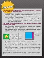
Bleed helps prevent the blank areas of the press stock from showing when the flyers
are cut down. For an example, see the images below:
crop marks
live
area
final
cropped
area
without bleed,
white lines may
be visible after
cutting
bleed
The black lines coming together at a right angle at the edges of the pages are crop
marks – the lines that a production specialist will use to trim a document.
The cutter uses 3,000 lbs. of pressure, which means that a given document can be
nudged slightly during a cut.
Without necessary bleed, there is no buffer zone of ink to negate the nudge of the
cutting blade. A small strip of paper without ink can sometimes appear along the
edge of the document as a result.
Conclusion// If a flyer has colors or images that extend to the edge of the page, it needs
bleed!
�
What software is recommended for printed media creation?
Most graphics professionals prefer Adobe Photoshop, Illustrator, InDesign, etc.
QuarkXPress is another industry-standard software created specifically for desktop
publishing.
Adobe products tend to be easier to work with, especially if they are readily available.
At the ASU Print & Imaging Lab, Adobe InDesign is the primary software used for file
creation and imposition.
Bleed settings are different across applications.
Adobe Illustrator or InDesign allows bleed to be added to a document in the initial file
creation dialogue box.
In Photoshop or any other image manipulation or drawing program, it is necessary to
add the bleed into the document size.
Ex: An 8.5” x 11” document that requires bleed should be designed as an
8.625” x 11.125” document.
Conclusion// Adobe products are a little easier to work with for beginners.
pPI
For a printed output, it is always important to think about the photo’s PPI
(pixels per inch), in relation to its size.
The larger the photo, the higher the PPI should be.
A large image with low PPI increases pixel visibility and image distortion.
An appropriate PPI for printing an image is 300, meaning 300 pixels will be printed in
every square inch of the photograph.
If a 1200 x 1200 pixel image is printed at 300 PPI, the image will be produced as a 4
x 4 inch document.
Conclusion// If you want a larger size of an image printed at 300 PPI, make sure the pixel
size of the original digital image is large enough to accommodate this.
�
DPI
In addition to PPI, DPI is an important term in a print shop.
DPI (dots per inch): Refers to a printer’s ability to recreate an image with ink.
Cyan, Magenta, Yellow and Key (black) colored dots are printed to recreate the pixel
hues seen in a digital image.
DPI is a technical aspect of a printer, like the screen resolution of a smart phone.
Better printers have higher DPI’s, which increases the quality of the gradation and
tone of a printed image.
Conclusion// Good PPI correlates directly with the file size of an electronic image, and
is measured in pixels. DPI is a measurement of the number of ink dots per inch for a
given printer.
Graphical elements like photos and clipart are created using pixels, which
means they are raster-based elements.
Stretching raster elements past native resolution (maximum size) results in quality
loss.
If the image is scaled down, the quality can remain unchanged so long as the PPI
is increased.
Use Photoshop, Paint, Word or Publisher for file creation.
For a high-quality flyer, don’t scale anything raster-based!
Vector elements are created using mathematical calculations, ensuring that
the integrity of their shape and quality will remain intact no matter how large
or small they are scaled.
Create vectors with Adobe Illustrator or InDesign.
Photoshop can also be used, but in very limited ways.
Ex: Photoshop Smart Objects or the Pen tool
Conclusion// Photoshop for raster images, Illustrator or InDesign for vector images.
�
cmyk
Printers use a combination of four inks to reproduce color on a printed page.
These four colors are Cyan (C), Magenta (M), Yellow (Y) and Key (K, or Black).
The CMYK color model is known as a subtractive color model.
White light illuminating the print is absorbed in various degrees by each of the inks.
Whatever portions of the white light are absorbed by the inks printed on the paper,
the remaining light is reflected back to the viewer, resulting in the appearance of color.
Ink Color
C
M
Y
M+Y
C+Y
C+M
Absorbs
Red Light
Green Light
Blue Light
Green & Blue Light
Red & Blue Light
Red & Green Light
Reflects
Green & Blue Light
Red & Blue Light
Red & Green Light
Red Light
Green Light
Blue Light
Appears
Cyan
Magenta
Yellow
Red
Green
Blue
RGB
The color model used in electronic formats (such as a computer screen) is
known as the RGB (Red, Green and Blue) color model.
The RGB color model is known as an additive color model.
Red, green and blue lights combine to create cyan, magenta, yellow and finally white,
when all three lights are combined.
output
CMYK and RGB color spaces translate differently between a computer screen
and a printer.
RGB looks great digitally, but not on paper.
This can often lead to some severe discoloration issues in output if the color profile is
not converted.
This image demonstrates the
hue variation between profiles:
RGB
CMYK
Conclusion// Use an RGB color profile for digital content. Use CMYK for print.
�
PANTONE
Pantone is a privately-owned corporation known for the Pantone Matching
System (PMS), a color matching system that allows color consistency across
devices and throughout the printing process.
This system requires specified printer inks that a commercial printer uses to hand-mix
the appropriate PANTONE color.
PANTONE colors – also known as “spot” colors – are separate from CYMK and must
be mixed independently from the cartridges in the printer.
The inks must be installed separately and often require a special naming convention
(callout) that will be read properly by the digital press.
Ex: If a document uses PANTONE 208, that element must be created with
PANTONE 208C (coated paper) or PANTONE 208U (uncoated paper).
The press needs to have the corresponding ink installed.
The press will use the PANTONE ink mixture only on elements that are named correctly.
PANTONE colors must be ordered for the digital press, and cannot be built using
CMYK methods.
dot gain
Another topic worth covering – at least briefly – is dot gain.
Printers use small halftone dots to reproduce color during the printing process.
Sometimes these halftone dots grow slightly larger than their intended size, either due
to the quality of the paper or the precision of the printer’s ink distribution.
Dots will then run together, decreasing contrast in tonality, and making the final image
appear darker than it should.
Most printing companies will know the dot gain percentage of their primary presses,
and will make corrections as needed during gamut conversion.
To account for dot gain during file creation, increase the midtone brightness of the
image in an image editor.
Photoshop can also embed a color space specifically for dot gain correction at various
percentages.
�
When creating or reproducing printed marketing materials that advertise an Arizona State
University event, the ASU Communication Guide standards must be adhered to. This guide
is located online at:
commguide.asu.edu/
ASU has specific parameters in place regarding proper logo, font and color usage. When
utilizing these elements, the established standards must be followed properly, or the piece
cannot be reproduced.
Logo Usage
The ASU logo and word mark can only be used by ASU faculty, staff, University units
and corresponding organizations.
In print, the smallest the logo can be is 5/16”.
For digital use, the logo must be at least 47 pixels wide.
There must be a proper “area of isolation” around the logo.
This area is essentially a margin that wraps the entire logo.
To determine the appropriate “area of isolation” for the chosen logo size, take the logo’s
current height, divide it by two, and use that measurement.
Ex: If the ASU logo on a flyer is an inch high, a margin of ½ inch should wrap
around the entire logo.
Color Palette
When sampling ASU-specific colors for printed material, the proper CMYK callouts
must be used.
The tables below give both primary and secondary color palette CMYK values.
CMYK 60, 40, 40, 100
CMYK 0, 21, 88, 0
CMYK 10, 97, 37, 43
CMYK 0, 0, 0, 0
CMYK 64, 5, 100, 24
CMYK 0, 52, 80, 0
CMYK 84, 21, 0, 0
CMYK 10, 13, 16 29
Font Usage
The official font of Arizona State University is Akzidenz-Grotesk Pro.
This font is used on every piece of marketing material the University produces.
When used as a design element, some restrictions do apply:
Only some structures of the typeface are allowed for various types of text.
Lower-case font should be used when typing expressions, with the exception
of proper nouns, legal entities and quotes.
�
 Historical archive . public document