Notifications and their effect on gratification in a
peer to peer donation smart phone application
Robert Janikowski, supervised by Jon Rokne
December 2018
University of Calgary, Department of Computer Science, Calgary, Canada
ABSTRACT
Homeless populations are having difficulties adjusting to the transition towards a cashless society, and
donors do not currently have a standardized way to donate electronically to recipients they meet on the
street. This study proposes an application that will make an electronic transaction between a donor
who has a smart phone and someone with little access to technology possible and cost effective. The
study will also improve upon the proposed application by implementing a notification system in order to
provide gratification for donors. This will provide a benefit that even cash donations cannot compete with,
enticing users to stay loyal to the QR donation platform and potentially becoming the standard for peer
to peer donations.
Keywords: QR, HCI, Donations, Cashless society,
Gratification
Introduction
Payment technologies have been advancing rapidly
in the past decade, bringing us closer to a truly cashless society. Payment services like PayPal, Venmo,
Credit Cards, Debit cards and eTransfers have become standards in large value transactions. However, small peer to peer transactions are still 75
percent cash (Figure 1). Homeless populations who
rely on pan handling as a main source of income
are finding it increasingly difficult to obtain physical currency as most potential donors do not carry
any on their person. Solutions for this problem involving smart phones and QR codes have begun to
emerge but nothing has become the standard for on
street donations.
The solution that aims to replace cash donations
would need to be easy and quick on the surface level
as the convenience of cash (when available) is still
what most donors will gravitate towards naturally.
This can be implemented with a readily accessible
smart phone application that has a clean user interface with a a quick payment scheme. The other
challenge to make an application appealing to a
Figure 1. Peer to peer transactions are made
predominately with cash.1
donor on the street would be satisfaction or gratification they may get from providing a in-person cash
donation. There are certain positive emotions that
the user can receive from the interaction, increasing their level of gratification as they walk away.
This study developed an application that attempts
to enhance this receipt of gratification by providing
the user with notifications that can provide more
feedback about where and when the donor’s contribution is being spent. The study hypothesized
that these notifications would overall increase user
gratification in the context of donations.
Gratification is the focus of this study instead of
speed and usability as it is likely to be the main
�
reason for a donor to decide to donate. Even though
the act of initiating a donation appears to be altruistic, it has been to found that the decision-making
process stems from selfish motivations2 . The primary motivating factor for a donation may in fact be
to make the donor feel better about themselves with
the additional side effect of helping someone else.
The person may also be praised socially for being
seen as altruistic and will likely be encouraged to
give again. These raise some interesting questions
which have lead to some new simple strategies to
increase repeat donations. Blood donation organizations have found success in providing donors a
text at the exact moment their blood is used which
has shown to increase repeat donations from young
users3 . Donor retention is a major problem for nonprofits who rely on donations but suffer from 90%
donor attrition rates due to the lack of feedback
they provide4 . Not seeing the immediate effect
for an action (like a donation) has been shown to
psychologically discourage the action from being
repeated3 .
This study implemented a notification system
similar to the one employed in the previously mentioned blood donation study, but instead used emails to notify the test participants. The notification would notify the test participant at the exact
moment and location that the donation was spent.
The recipient would have a business card sized donation card that can be seen in Figure 2. These cards
would be a cheap scanning medium that could be
mass-produced for recipients to carry. The balance
that is accumulated on the spending card would
then be spent by the recipient at partnered locations
that are decided by the application developer. This
will give the donors the comfort of knowing that
their donations could only be spent for what they
were intended for. With the combination of ease of
use of QR code scans5 and a system that allows the
user to feel gratified, this application could create
a standard for giving to those who are homeless.
The resulting application has the transparency that
younger generations today expect when donating
their money6 and will be budget friendly so that
wide adoption would be maintainable by a nonprofit or social enterprise. Ultimately, the applica-
tion created for this study helps solve 4 major utility
problems that cash donations currently have:
• Not having physical currency on person
• Worrying the donation may not be spent on
what it was intended for
• Feeling unsafe about pulling out wallet or cash
• Potential to feel uncomfortable with the donation interaction
Figure 2. The business cards that recipients
would present to the user donating through the
application. The QR code would likely be a printed
sticker that would later be put on the card to save
costs.
There are some challenges to be expected when
creating phone applications. The mass market adoption of an application such as this has many barriers
to entry. This application would need to be downloaded from the App Store but the average amount
of apps a user downloads per month is zero7 . The
app store has become a flooded market and most
users only use a handful of apps they are familiar
with, uninstalling any apps they don’t use anymore.
2/6
�
Therefore, it is important that the app has a premium user experience and is easily obtainable by
scanning a QR code on the back of a recipient’s
card.
Security is always a challenge when dealing with
payment transactions. The application will be using
bio metrics to verify identity and the Stripe API to
handle the payment transactions. The identity of
the recipient will not be displayed on the QR card
as to ensure privacy.
Method
The data in this experiment was gathered with formative usability testing using a two part survey. The
first part of the survey was an in person meeting
where the participant is initially asked to answer
the first question on the survey before being told
any further information. After this, the participant
received an explanation that the study is to test the
experience for an app meant to help make donations
to recipients they meet on the streets. The participant was then asked to imagine a scenario where a
homeless recipient may approach them on the street.
The homeless recipient would then ask for a cash
donation to which the participant cannot provide,
so the homeless recipient pulls out a business card
with a QR code (Figure 2) asking if the participant
has the app. The participant was then told that we
are assuming that the app is already on their phone
in the imaginary scenario. After this the surveyor
showed the user experience flow of the app (user
flow shown in Figure 3), where the QR code was
scanned until the point where the purchase goes
through using Apple Pay(with bio-metric fingerprint). The participant was told the purchase was
a real transaction and will be a donation made in
exchange for their participation. After the demo,
the participant finished the rest of the survey where
they selected a donation recipient name and rated
the app experience. After the survey the participant
was told to expect one or two e-mails with a survey
the following day.
The second part of the experiment involved sending an e-mail to only half of the participants. This
e-mail contained a statement notifying them that
Figure 3. Step 1: User scans the recipient’s QR
code. Step 2: User selects a donation denomination
amount. Step 3 (Optional): If user does not have
Apple Pay, can manually input credit card
information. Step 4: User confirms donation with
bio-metric fingerprint (if using Apple Pay).
their donation had just been spent (in-real time) by
the name they selected at a local food establishment. The other half of the participants are the
control group. Every participant is sent the same
follow-up survey.
The participation pool sex ratio for the first survey was 50 percent male and 50 percent female with
the pool total equaling 18. The target group for the
participants was students (aged 18-24), as they are
more open to adopt new technologies3 . The participants were selected and solicited to complete the
survey at random. Selection bias for participants
was minimized with a low choice strategy. The
surveyor went to the University during a Saturday
and Sunday evening where the selection pool was
smaller compared to a normal school day.
Results
The participants were first asked what they consider the largest challenge to be when donating to
3/6
�
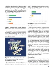
a panhandler they may meet on the street. The results showed 2 major concerns: the highest concern
being lack of possessing pocket change (78% of
respondents) and the second highest concern being worried how the money may be spent (44% of
respondents) as shown in Figure 4.
Figure 6. Participants were 60% satisfied, 28% very
satisfied with only 10% deciding that they were
neutral in their level of satisfaction.
Figure 6. Participant’s level of satisfaction
regarding the transaction.
Figure 4. What participant’s consider the biggest
challenge when giving an in-person cash donation.
The participant’s were then asked to manually enter one word to describe the transaction experience
which is shown in Figure 5. The only words that
were repeated were Fast, Easy and Simple; each
being repeated 3 times.
Figure 5. Word cloud of participant’s free form
one-word description of the app transaction.
Bigger words are repeated.
The participant’s were asked to rate their level of
satisfaction regarding the transaction as shown in
For the second part of the study, participants were
asked to fill out a follow up survey that was sent
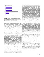
to them through e-mail. Only 50% (9 respondents)
completed the follow-up survey. Of the 9 participants that completed the follow-up survey, 5 of
them were part of the test group and 4 of them
were part of the control group. The control group
showed 0% change in satisfaction in the positive
or negative direction while the test group showed
40% of participants were more satisfied(Figure 7),
20% less satisfied with a net satisfaction increase of
20%. Due to the small sample of categorical data,
a Fisher’s Exact Test was performed (p = 0.2857)
showing that the upward trend is not statistically
significant.
The final question asked to rate the participant’s
likeliness to recommended the app in the future
(0-min, 5-max). The control group provided an
average rating of 3.0 (min of 2, max of 5) while the
test group had an average rating of 3.8 (min of 3,
max of 5). The test group is 16% more likely to
recommend the app in the future.
Discussion
The first question of the survey served to see what
difficulties participants thought they would experience in the scenario they were presented (as seen
in Figure 4). It was expected that the most important challenge would be not possessing physical
4/6
�
Figure 7. Result: Comparison of the control
group with the test group of the gratification level
difference since the initial transaction.
currency since most payments are cashless now6 .
The second highest response was worry that the
money may not be used what it was originally intended for. This was also expected as this is a major
concern shared by the British government’s attitude
toward beggars8 . Some participants wanted to answer "none of the above" but were unable to as the
survey question only had an "Other: please specify"
option. The 4 challenges in this survey question are
all theoretically addressed by an app such as the
prototype that was shown to the participants.
The word cloud in Figure 5 shows that 94%(17)
of the participants used a positive word to describe
the transaction with only one word possessing a
negative connotation. The only three words that
were repeated were fast, easy and simple. This is
very promising as the app would have to rival the
simplicity of a peer to peer cash donation. If the
notification adds more value compared to a cash
transaction, then it may increase the chances that a
system like this could be widely adopted.
The test for this study was determined by the respondent’s follow-up survey. The initial survey was
completed by 18 participants but the follow-up survey was only completed by 50%(9) of participants.
The lack of follow-up in this participation had made
it difficult to obtain a result that could be optimally
statistically tested. However, this appears to be a
typical occurrence in formative user testing where
82% of such studies have less than 15 test participants but achieve the feedback they need with a
minimum of 5 users9 . The results from these type of
tests can often provide usable results in a user experience testing scenario that can be safely acted upon
without the confirmation of statistical significance.
This study may just need to involve a larger initial
survey participant pool with the expectation that
50% will not complete the follow-up survey. Based
off of this studies’ participation, an initial pool of 40
participants should suffice in a continuation study.
The alternative would be to change the structure of
the study so that it avoids a follow-up survey and
tests the receiving of a notification during the first
survey completion (which may be challenging to
emulate how the real app would work).
There was a participant in the study who was in
the test group (that received the notification) who
stated that they were less satisfied since the initial
transaction. Their explanation for this was due to
their own research they found "people pan handle
to pay rent and this app would not allow them to do
that". It should also be noted that this participant
was an outlier in their response time to complete the
follow-up survey, as they completed it 3 days after
the suggested time. The rest of the test group had
completed the survey almost right away (within a
few hours, where they received the notification earlier that day). This may suggest that the participant
could have possibly forgot about the notification
they had received. It is also possible that the participants who did receive the notification formulated
a more polar opinion about the application due to
Figure 7 showing more variance (in both directions)
compared to the control.
The last survey question shows that the test group
is 16% more likely to recommend the app. This
statistic may not necessarily support the hypothesis
however, as the higher rating could be attributed to
the simplicity and fast transaction experience of the
app and not an increase in gratification.
5/6
�
Summary
This study used formative usability testing in order
to determine if a notification can influence a user’s
feeling of gratification. The results found that there
was a small trend where users felt slightly more
satisfied with the transaction when receiving the
notification, compared to the control who’s satisfaction levels did not change at all. A continuation of
this study would be required to collect more data as
there was not enough follow-up participation. The
results were not found to be statistically significant.
References
84, DOI: 10.1145/2835966.2835977 (ACM,
New York, NY, USA, 2015).
6. Rovner, M. & Loeb, P. The next generation
of american giving: The charitable habits of
generations y, x, baby boomers, and matures
(2013).
7. Lella, A. & Lipsman, A. The 2017 u.s.
mobile app report. link https://www.comscore.
com/Insights/Presentations-and-Whitepapers/
2017/The-2017-US-Mobile-App-Report?cs_
edgescape_cc=US (2017).
8. Economist, T. Tough love.(british government’s attitude to poverty). The Econ. (UK)
(2000).
1. Matheny, W., O-Brien, S. & Wang, C.
The state of cash: Preliminary findings
9.
from the 2015 diary of consumer payment choice.
link https://www.frbsf.org/
cash/publications/fed-notes/2016/november/
10.
state-of-cash-2015-diary-consumer-payment-choice/
(2016).
2. Tusche, A., Böckler, A., Kanske, P., Trautwein,
F.-M. & Singer, T.
Decoding the charitable brain: Empathy, perspective taking,
and attention shifts differentially predict altruistic giving.
J. Neurosci. 36, 4719–
4732, DOI: 10.1523/JNEUROSCI.3392-15.
2016 (2016). http://www.jneurosci.org/content/
36/17/4719.full.pdf.
Sauro, J. How many users do people actually
test? link https://measuringu.com/actual-users/
(2010).
Nguyen, T. et al. Interactive philanthropy: an
interactive public installation to explore the use
of gaming for charity. In Proceedings of the
Designing Interactive Systems Conference, DIS
’12, 482–485 (ACM, 2012).
3101765
3. Foth, M., Satchell, C., Seeburger, J. & RussellBennett, R. Social and mobile interaction design to increase the loyalty rates of young blood
donors. In Proceedings of the 6th International
Conference on Communities and Technologies,
C&T ’13, 64–73, DOI: 10.1145/2482991.
2483007 (ACM, New York, NY, USA, 2013).
4. Gilad, Z. & Levontin, L. The effect of information about previous donation impact on recurring donations. Adv. Consumer Res. 45 (2017).
5. De, P., Dey, K., Mankar, V. & Mukherjea, S.
An assessment of qr code as a user interface enabler for mobile payment apps on smartphones.
In Proceedings of the 7th International Conference on HCI, IndiaHCI 2015, IndiaHCI’15, 81–
6/6
�
 Historical archive . public document